Sixt : Ride
Sixt, the international mobility services provider, delivers premium chauffer-driven rides as well as affordable taxi bookings via it’s cab-hailing vertical, known simply as Ride. Focused on providing reliable, comfortable and personalized transport at an attractive price, Ride is trusted by customers across continents, in both business and consumer segments.
My Role:
As part of the Ride design team, I redesigned two key touchpoints: the website booking funnel & the post-journey feedback funnel on the mobile app.
I was the sole owner for these activities, from research & analysis, to design and testing. I worked closely with product and business teams, held design workshops and user testing sessions.
Ride : Web Booking —
Simplifying ride booking across regions
Context:
The existing offer listing page for Ride was outdated and needed a refresh. As a market leader operating across Europe and America, Sixt required a design approach that balanced both consumer and business clients. This meant balancing user expectations for premium chauffer rides to discount-coupon purchases, individual and group bookings, and even unique modes like water-taxis.
A previous redesign attempt had led to poor usability and increased drop-off rates, resulting in a rollback to older version. Future design changes needed to enhance the user experience without compromising funnel conversion performance.
Business Needs
- Highlight Sixt’s premium service
- Communicate affordability and competitiveness
- Maintain or boost conversion rates
- Modernize funnel design
Challenges
- Diverse user needs across regions
- Service expectations vary by domain
- Balancing premium feel with affordability
Analysis
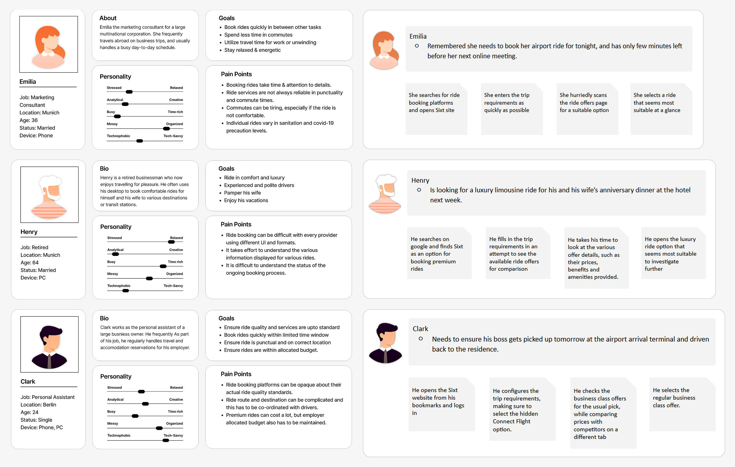
Persona
Existing brand guidelines and user data was analysed for mapping target personas and core scenarios, which would help guide all subsequent activities.
Heuristics
Detailed heuristic analysis of both the current and rolled-back versions of the page was conducted to identify usability issues, using Weinschenk and Barker classifications. The small taskflow from homepage to offers list to payment was broken down into smaller cognitive steps and rated for friction points that may contribute towards task failure or abandonment.
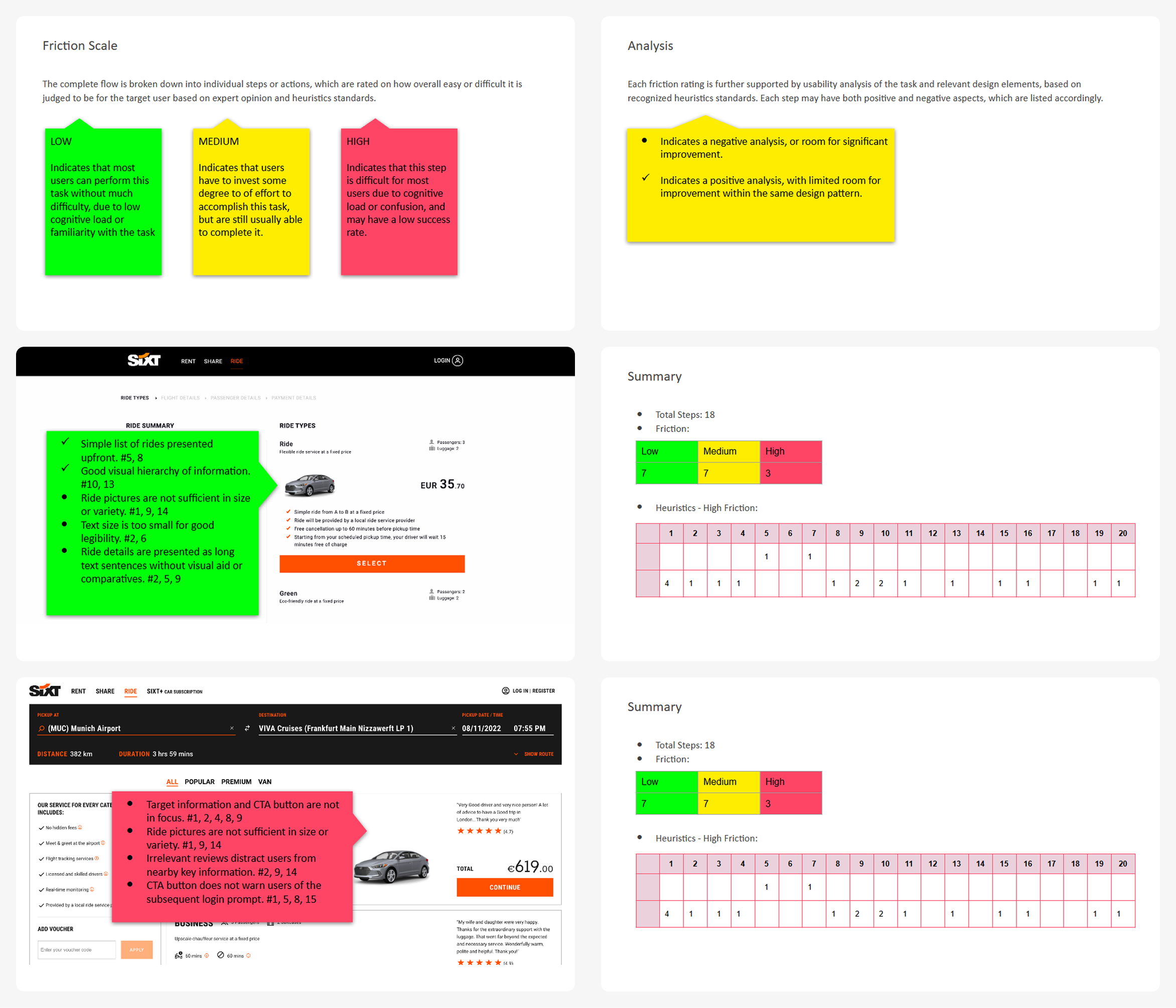
Summary
- Total number of cognitive steps for the entire task needs to be reduced
- Ride features information needed to be simplified for easier reading and comparison
- Bugs and annoyances in the UI need to be fixed to improve user confidence
- Overall accessibility standard needed to be improved
Content
The heuristic analysis revealed not only usability issues but also unexpected quality issues in the copy text and image assets. This led to a deeper analysis of the Ride page population dataset to verify the extent of the problem and opportunities for improvement.
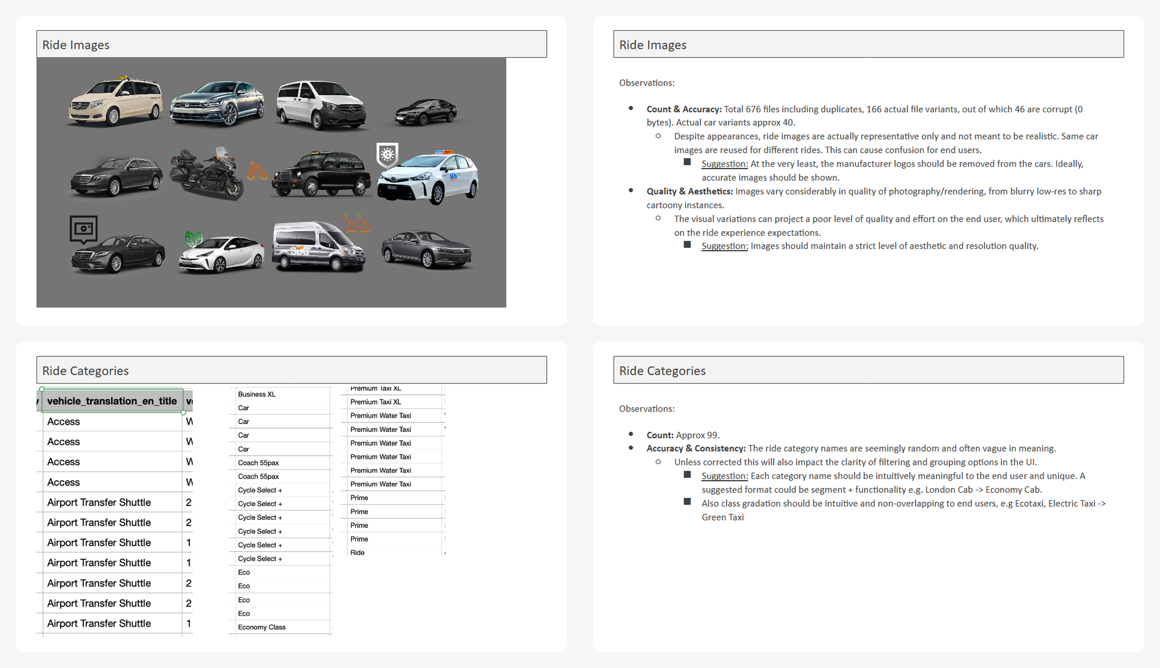
Severity scale by expected impact
- High: Ride Benefits
- Mix of marketing statements. tangible and intangible benefits
- Moderate: Ride Images, Ride Description
- Lack of standardized visuals
- Mix of style and tonality in descriptions
- Low: Ride Categories
- Lack of clarity and standardization
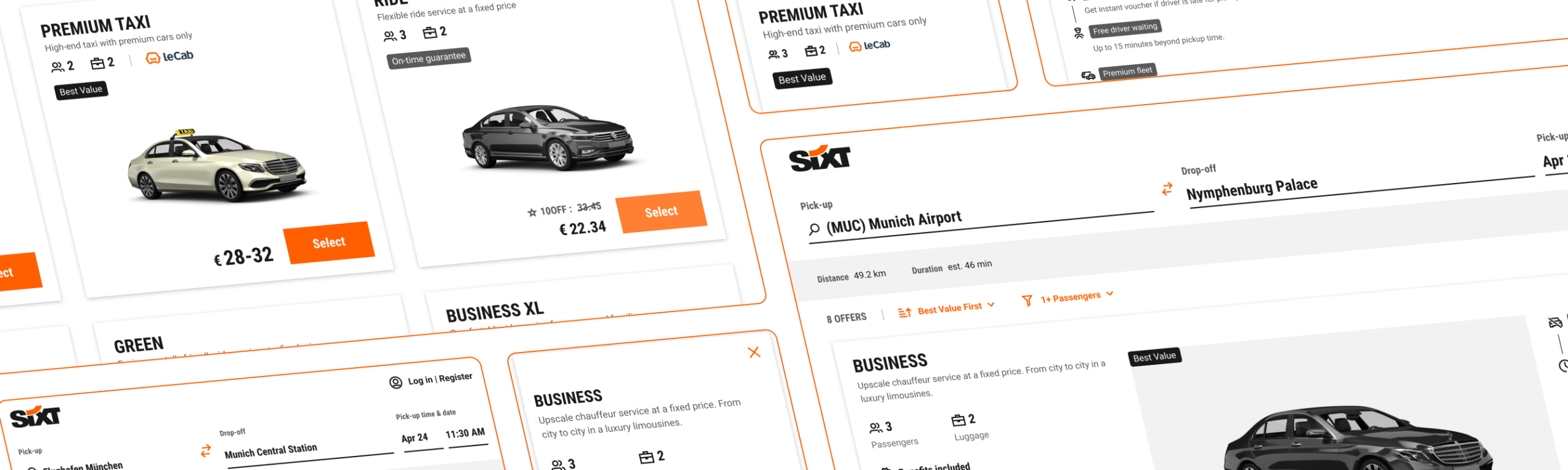
Competitive Analysis
General UX analysis of the ride booking web pages was performed for major market competitors. Only the taskflow from landing page till actual list of available rides was considered, with a special focus on parallels with Ride website.

Summary
- Most competitors lack a reliable ride listing page, indicating a market gap.
- Available booking flows often suffer from poor transparency, inconsistency, and technical glitches.
- Some rivals offer advanced location pickers with categorized suggestions and airport details.
- Vehicle visuals are noticeable as a key branding and familiarity element.
- Blacklane in particular closely mirrored Sixt in branding and service positioning.
Planning
Design Goals
Based on the research & analysis, primary goals were set for the design approach.
1. Quick selection of offers
- Quick understanding of ride features → Simplicity
- Easy comparison of available offers → Predictability
- Learnable UI for repeat customers → Consistency and Accessibility
2. Showcase Sixt advantage
- Premium cars → Luxury limousines and eco-friendly sedans
- Ride benefits & cost → Competitive rates for premium service
- Friendly & Reliable service → Professional chauffeurs & service guarantee
Content Mapping
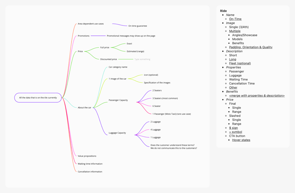
Based on ride database analysis, cleaned up content categories were mapped for the ride cards, using all expected combinations across serviced regions.
Design
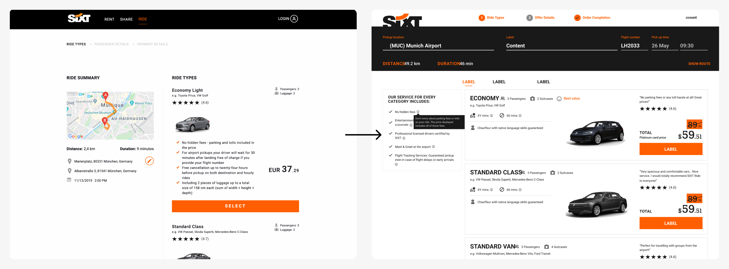
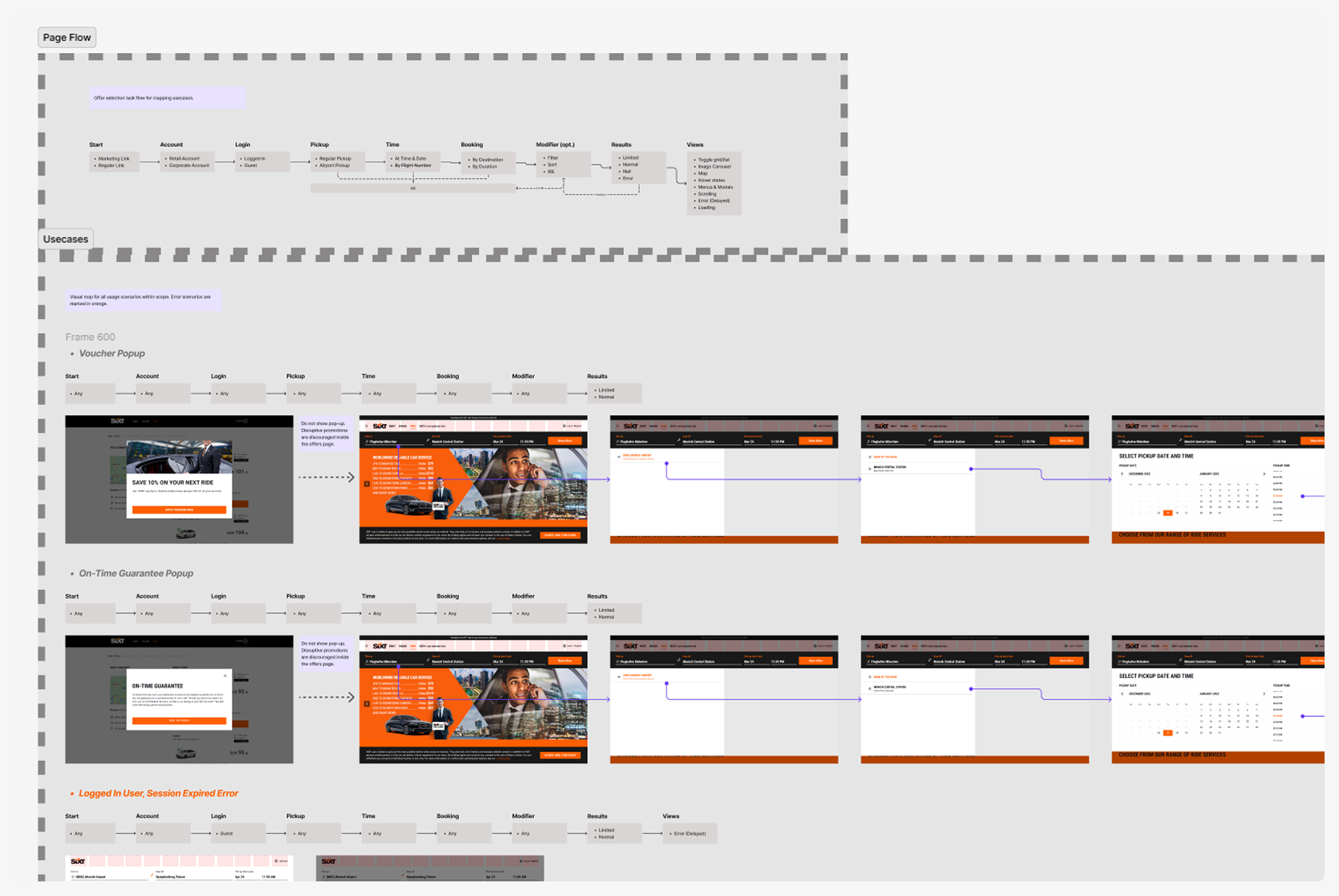
Wireframes & Rapid Prototypes
Once expected content was mapped, rapid iterations of design mockups were performed in conjunction with stakeholder alignment sessions, to maintain a common consensus while exploring design solutions.
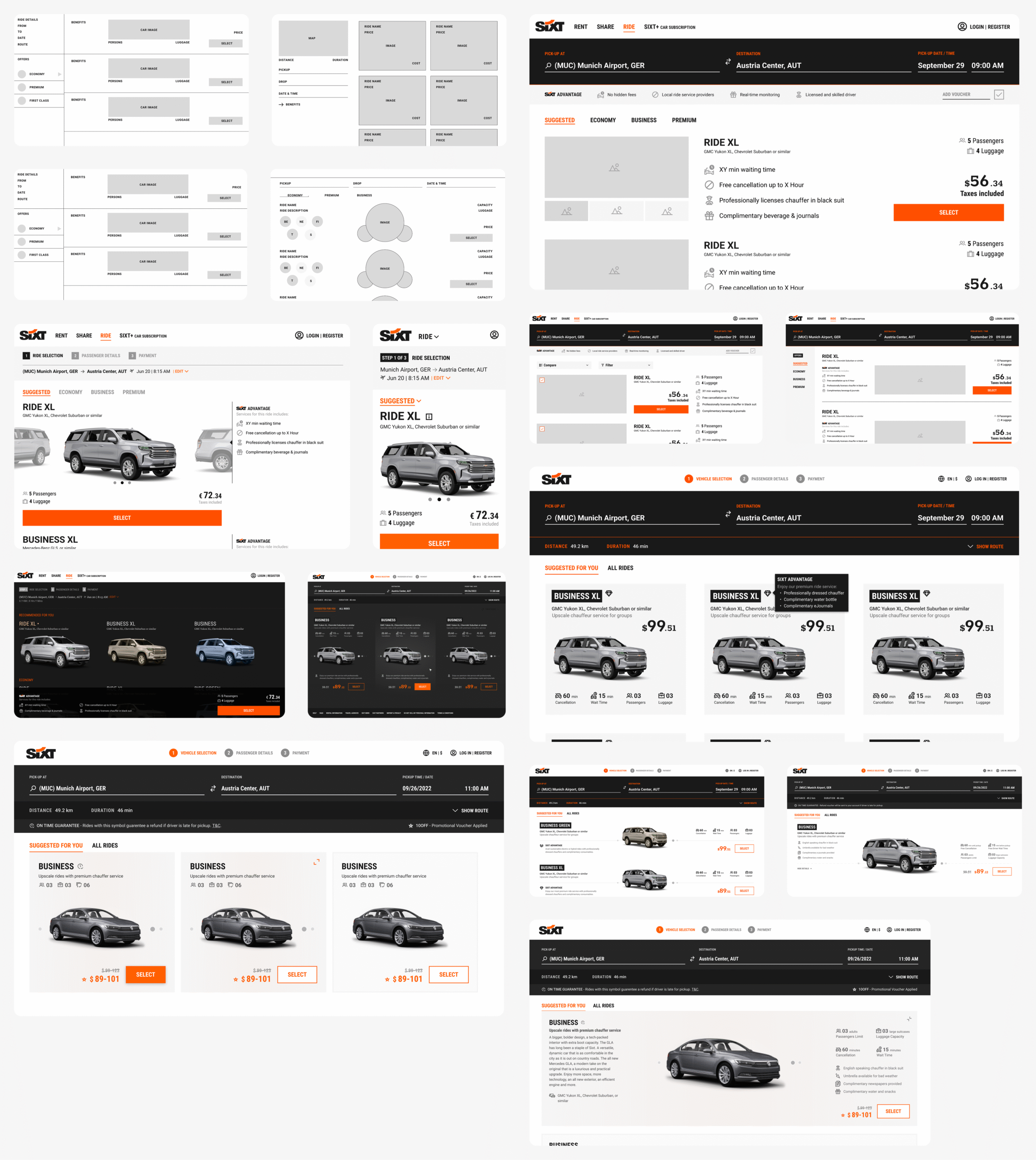
Key Insights
- The number of clicks to payment page needed to be a small as possible, so showing details as a secondary step or pop-up was not feasible
- Regular users didn’t need detailed info on rides, but it was important for luxury & business users, as well as for brand value, so content could not be trimmed too much.
- Many proposed visual treatments, such as those related to luxury branding like dark backgrounds, micro-interactions and hover effects, did not align with then Sixt design system.
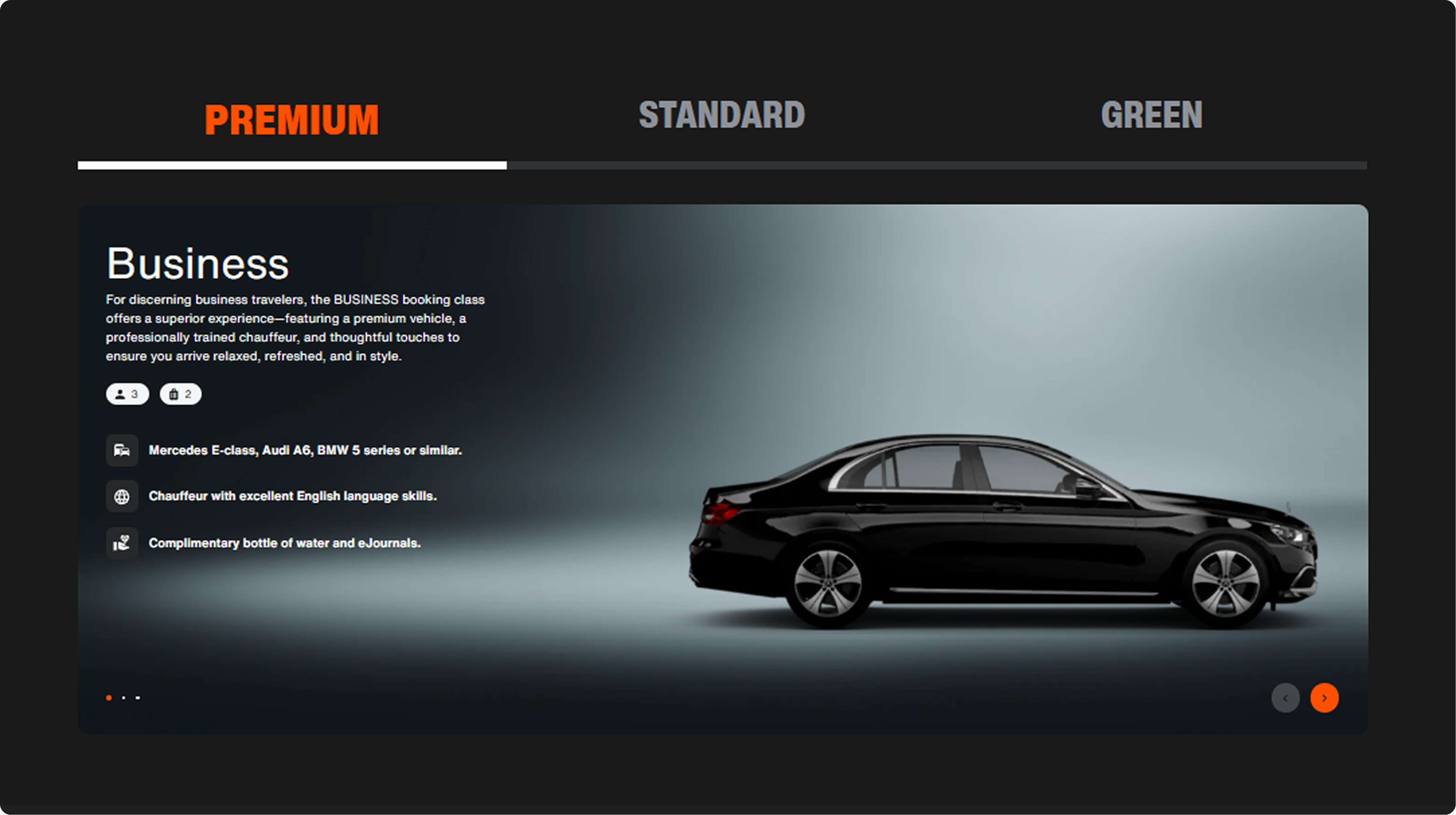
Final Version:
The final design was created using the Sixt design system, with detailed component specs and use-case maps, created in collaboration with business and dev teams to ensure all edge-cases such as error handling, pop-ups and empty states are within design. This also ensured effortless handover for development later.
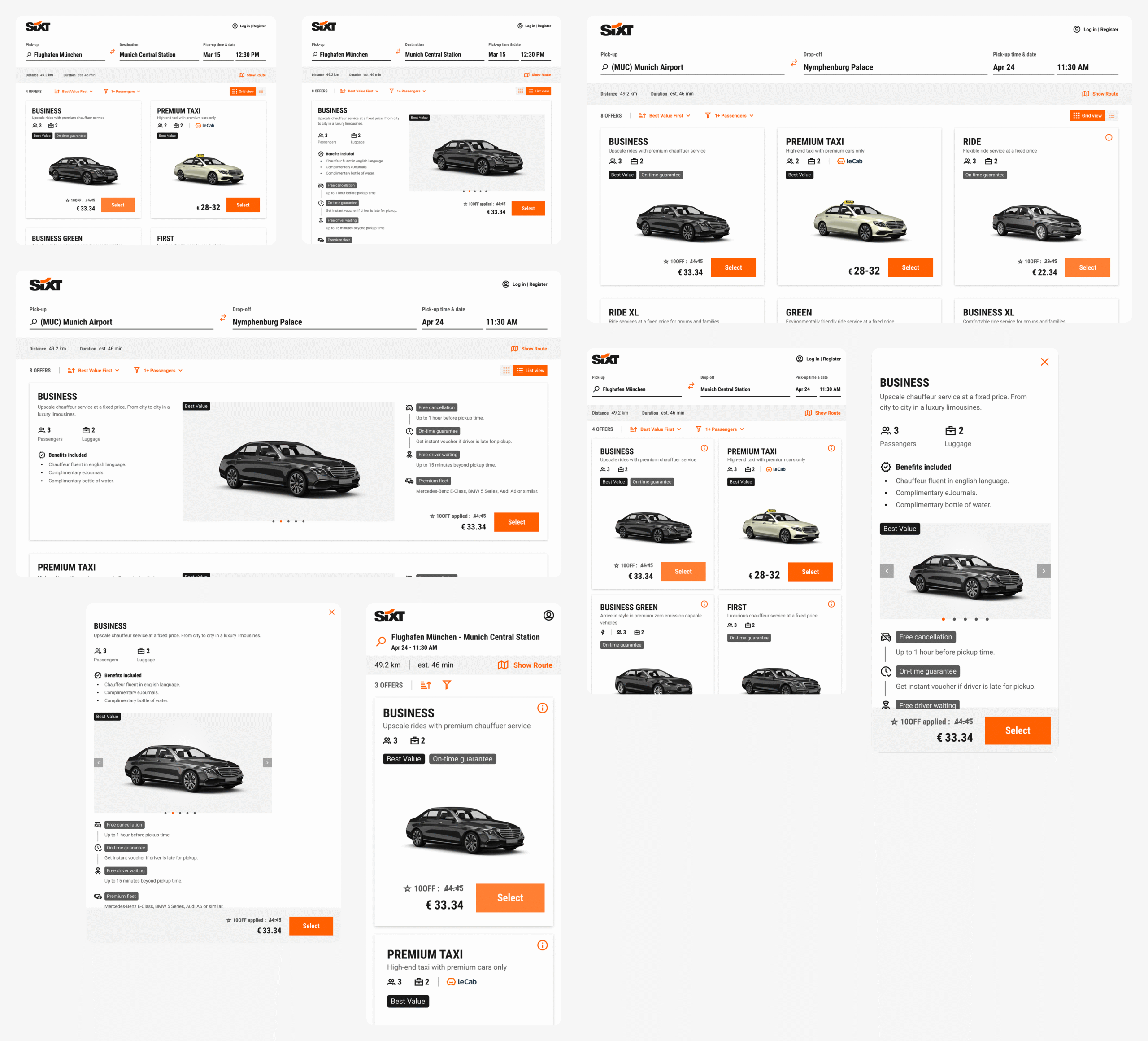
Key Features
- Clear visual hierarchy, with focus on vehicle images
- Improved structure for easy comparison of rides
- Dual layout modes, for both regular and discerning customers
- Simplified content, with clear & tangible ride benefits list
- Intuitive ride timeline for user trust
- Reduced disruptions, with removed pop-ups and UI bug-fixes
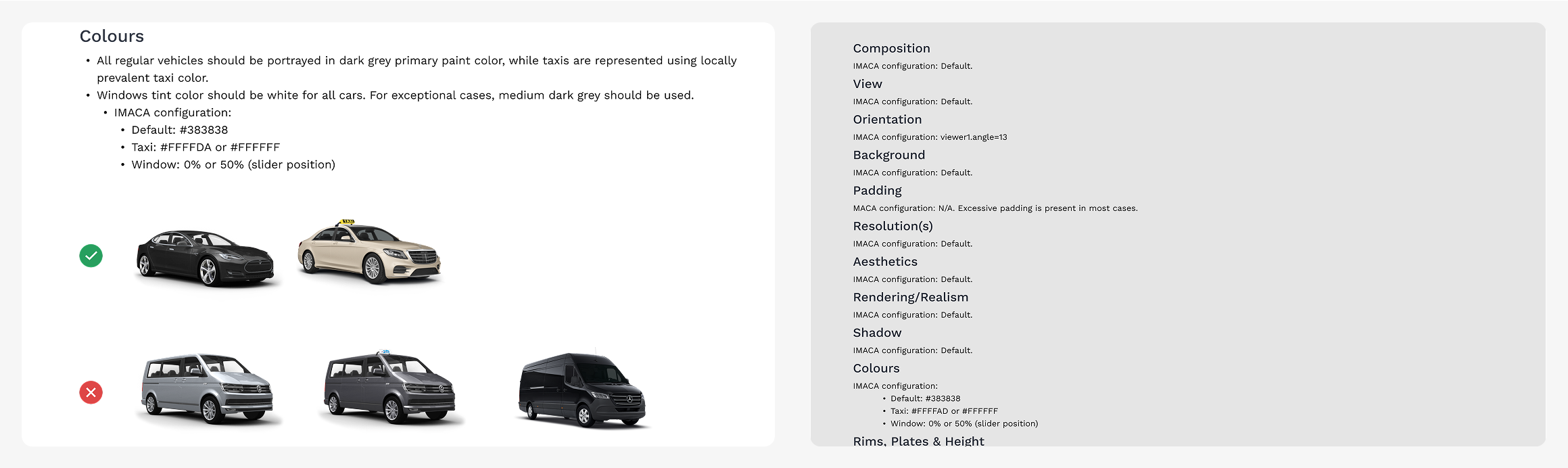
Image Guidelines:
As a companion to the new design, detailed guidelines for the vehicle images was created to mitigate content related issues identified in the analysis stage, and later validated during user testing. This included guidance for image aesthetics like angle and background, as well as technical specifications for using the internal photogrammetry tool.
Refinement
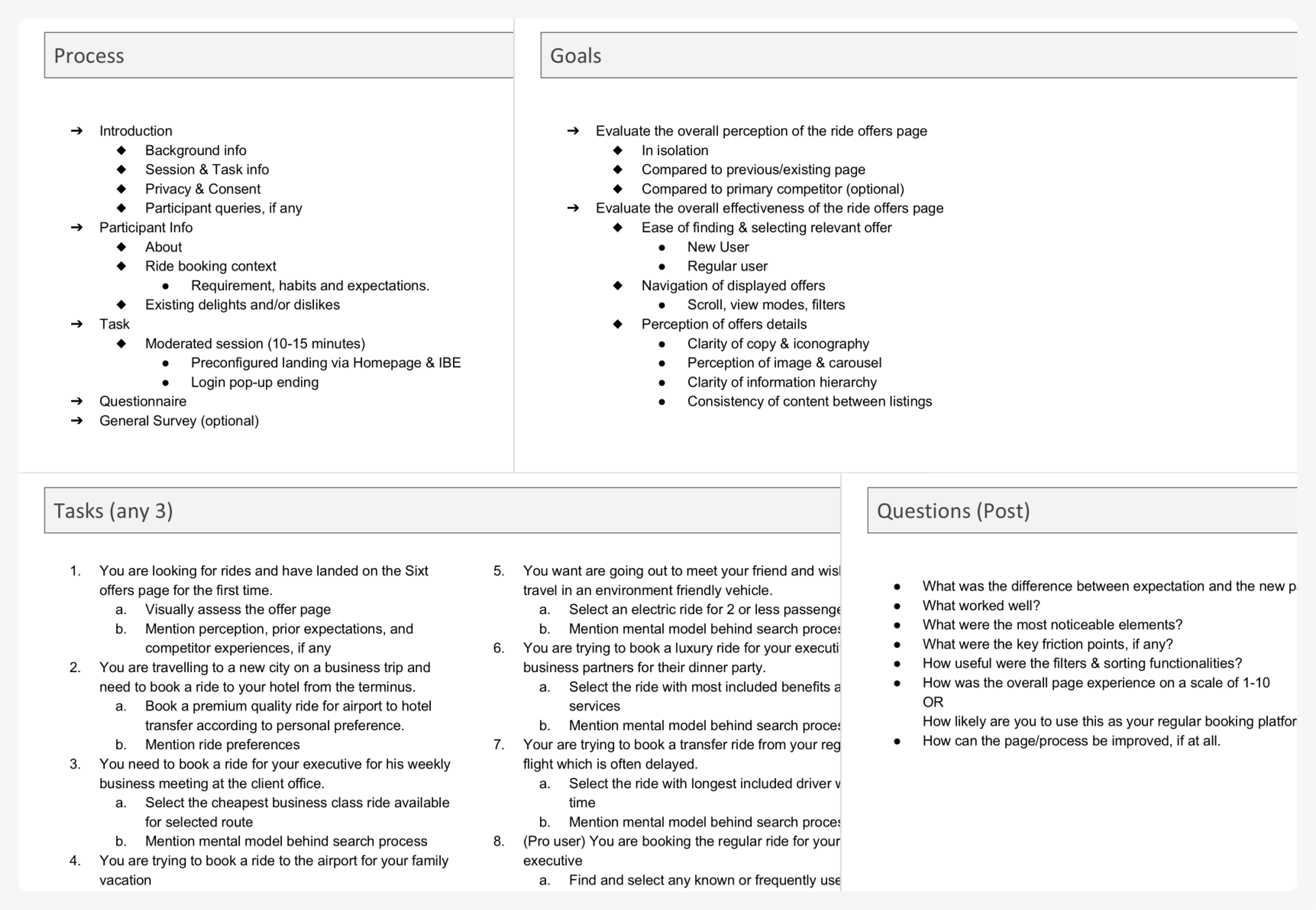
User Testing:
The finalized design underwent usability testing with real users to validate key interactions and overall experience. Users were given task scenarios to complete, and asked follow up open-ended questions to gather qualitative insights.
Feedback from these sessions was largely positive, requiring only a few focused refinements, such as improving copy text clarity for filters and fine-tuning button interactions to enhance usability.
Launch:
Feedback from users and stakeholders were both positive and led to successful launch of the redesign, servicing the platform for over two years till date (2025).
Retrospective:
In retrospective, I feel that the “premium” aesthetics part of the original design goal was under-achieved. Due to limited project scope, strict requirement to use existing design system components led to near-direct translation of concept designs into standard components, and dropping of many stylization features. The biggest offender was perhaps the white-only card element, which became clinical in look and feel over the white background.
The delivered result was still reliable and cohesive, but lacked the aesthetic polish intended. Although out of scope, pushing for targeted component extensions or additional rounds of design iteration using existing components could have delivered improved results.