
Philips : CT Trauma
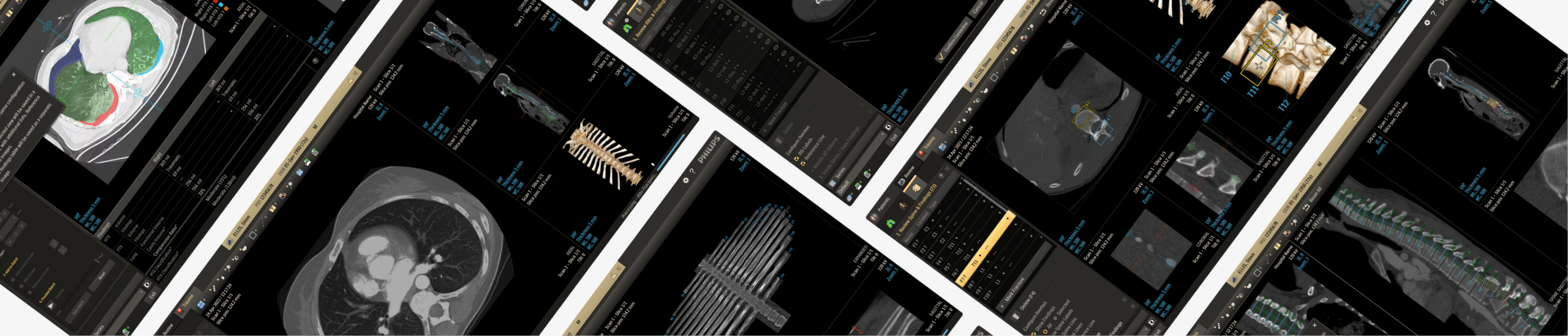
Philips CT platforms pair advanced imaging hardware with specialized software that supports a wide range of clinical workflows. Shared applications for trauma, cardiology, neuroimaging etc. offer automated reconstruction, AI‑assisted detection, dose optimization, and advanced visualization; enabling faster, more accurate diagnostics and streamlined operations.
My Role:
As part of the CT design team, I functioned as design owner for the Precise Trauma application. I worked closely with clinical, usability, and R&D teams to align product vision with user needs, led design activities as per project timelines, and assisted in user testing and safety analysis.
I collaborated with fellow designers and team leads to exchange ideas and ensure design alignment with platform and domain standards.
CT : Trauma app —
Improving precision workflows in emergency care
Context:
CT software development follows strict medical device regulations and involves close collaboration between designers, engineers, clinicians, and regulatory teams. Guided by the Product Development Lifecycle Management (PDLM) framework, it progresses through gated phases with defined deliverables and reviews to ensure a “first-time-right” product.
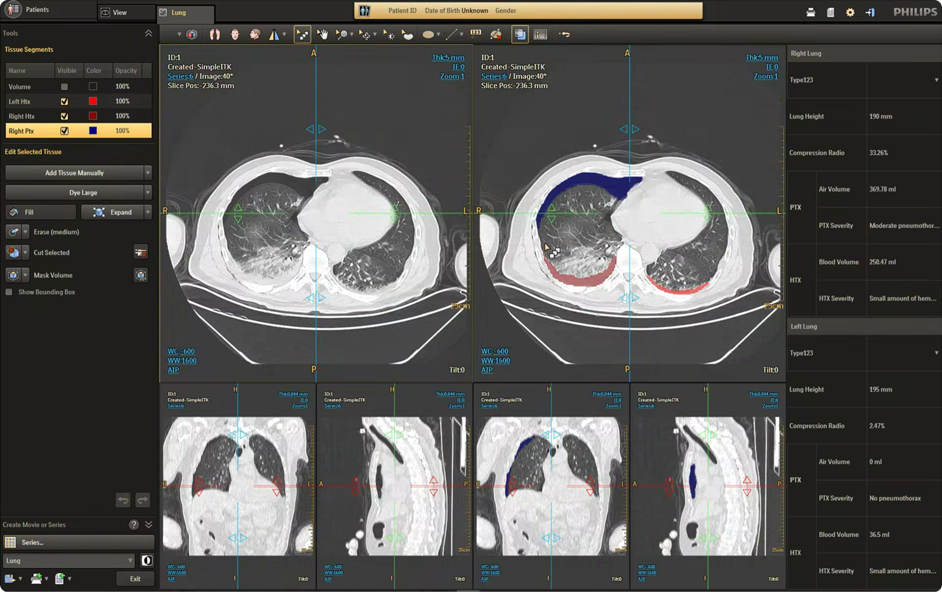
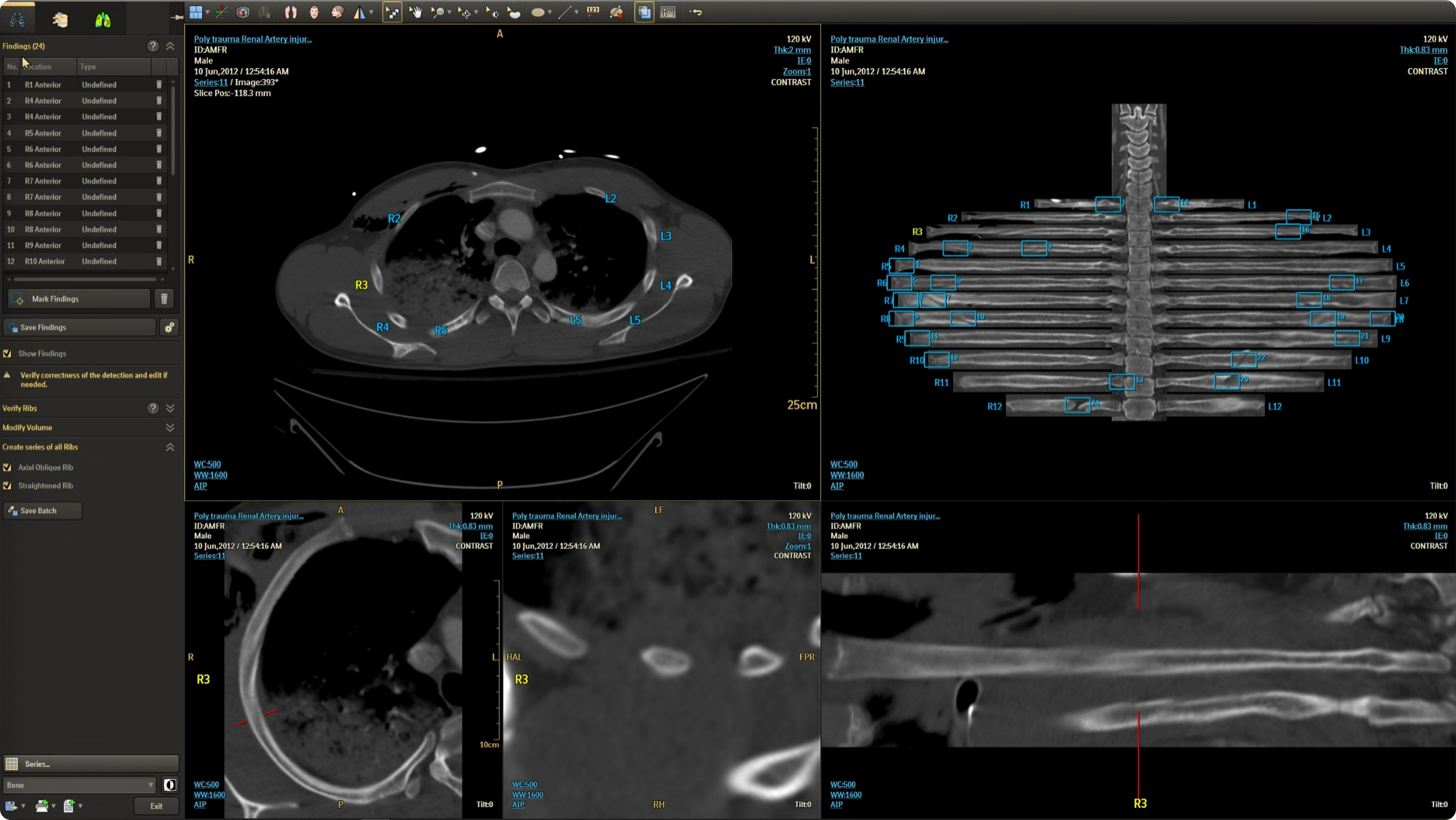
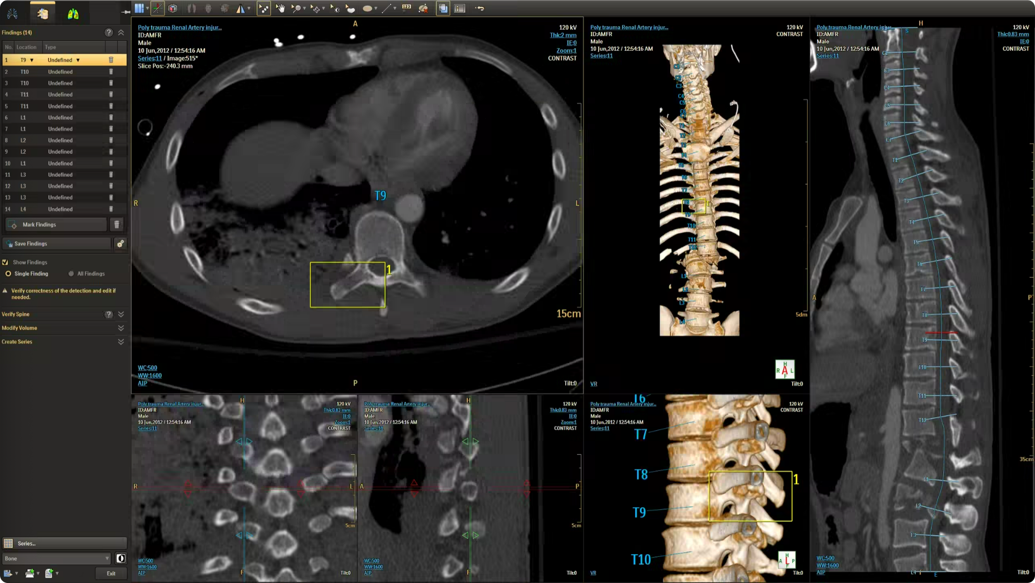
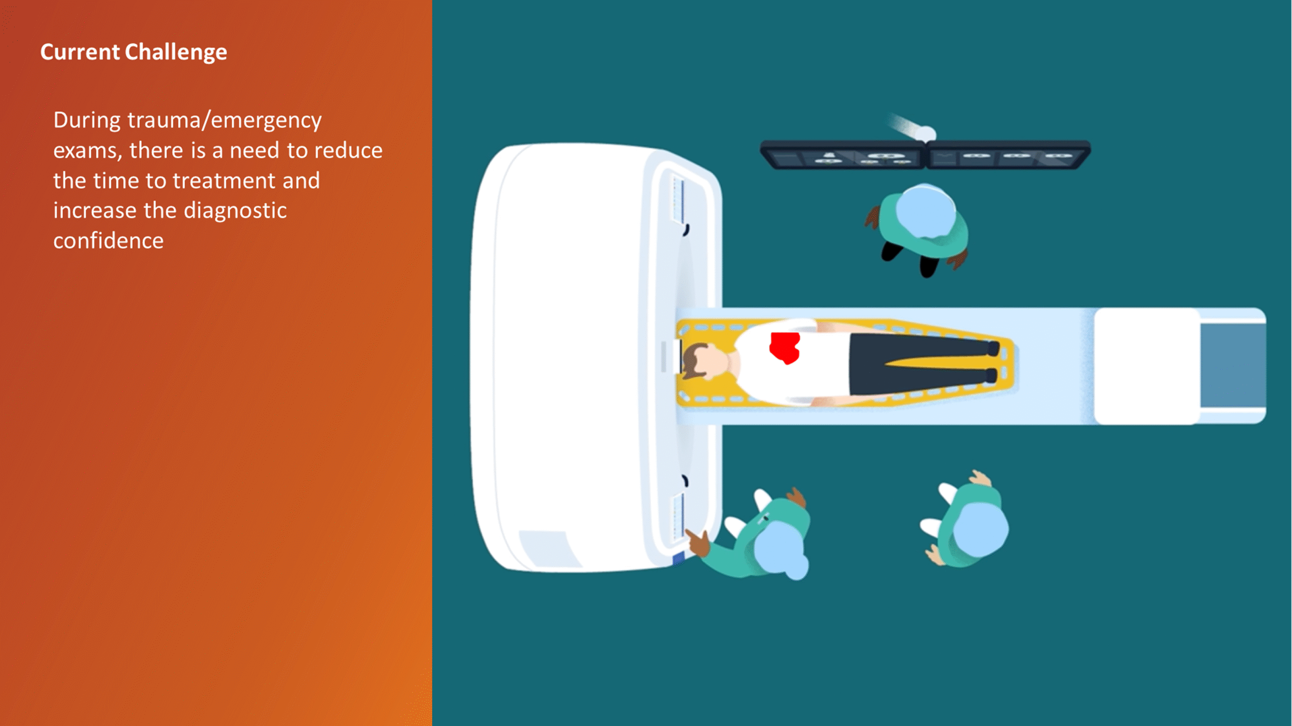
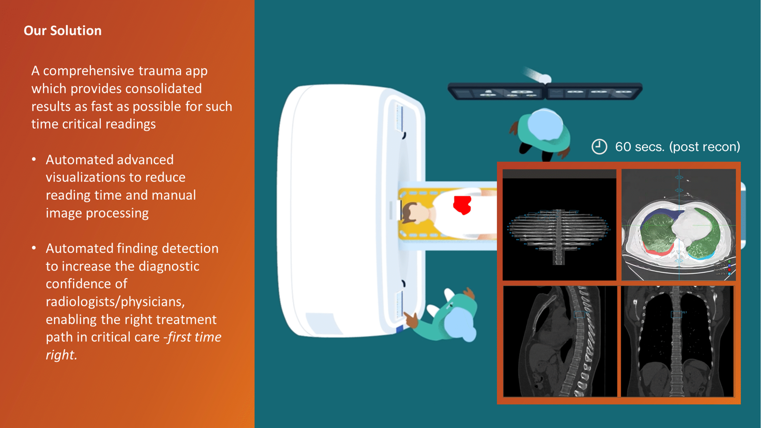
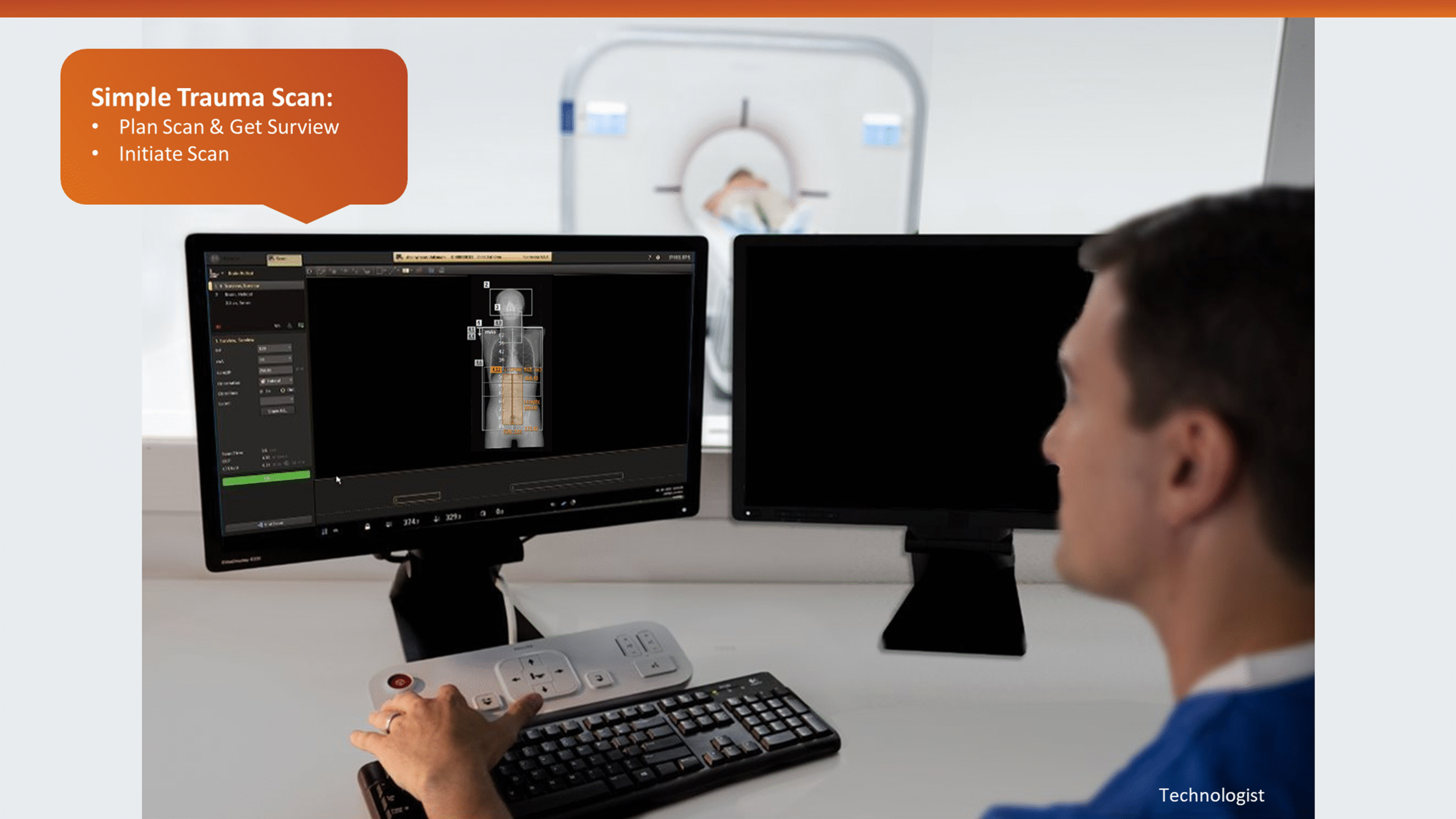
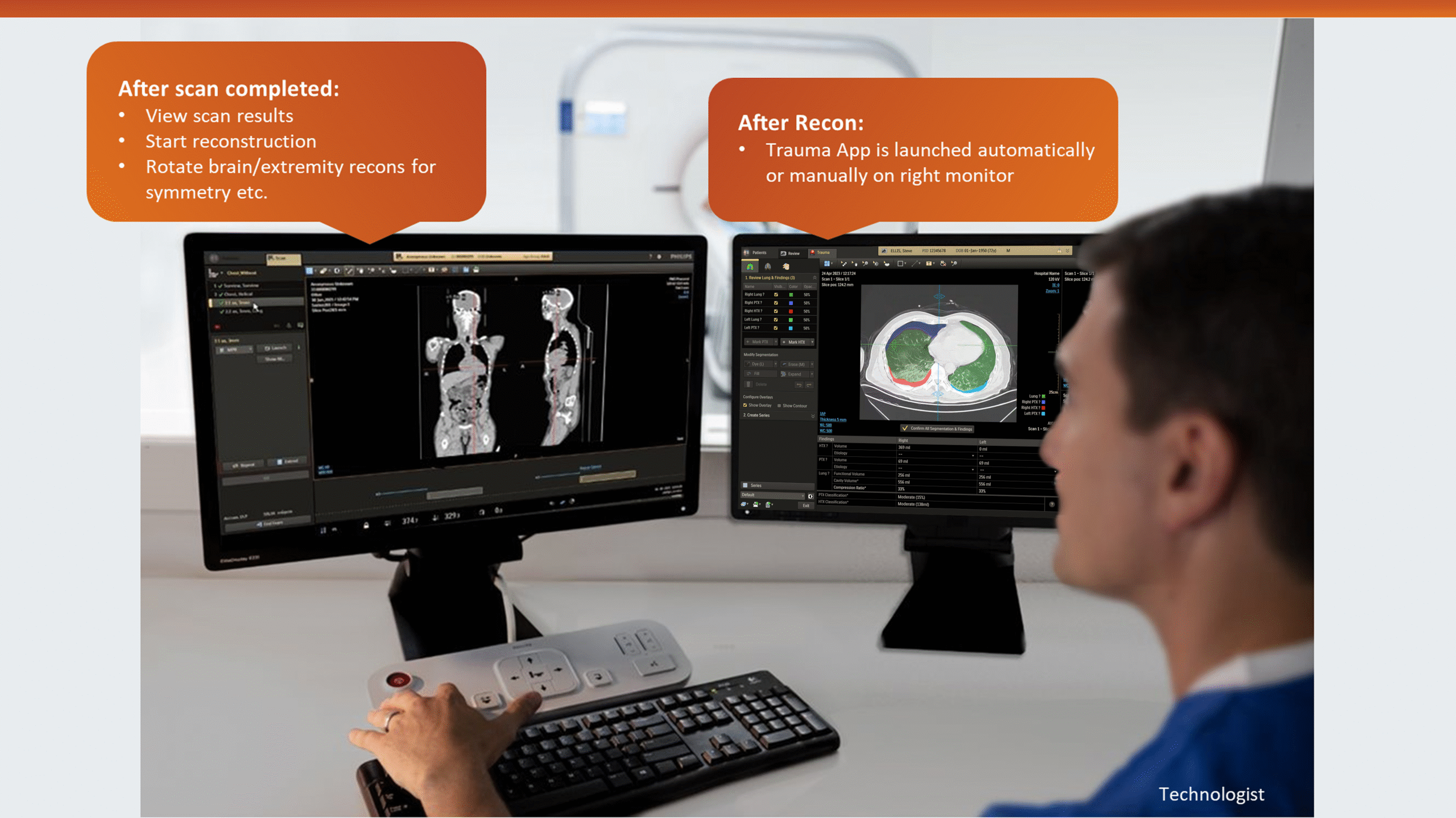
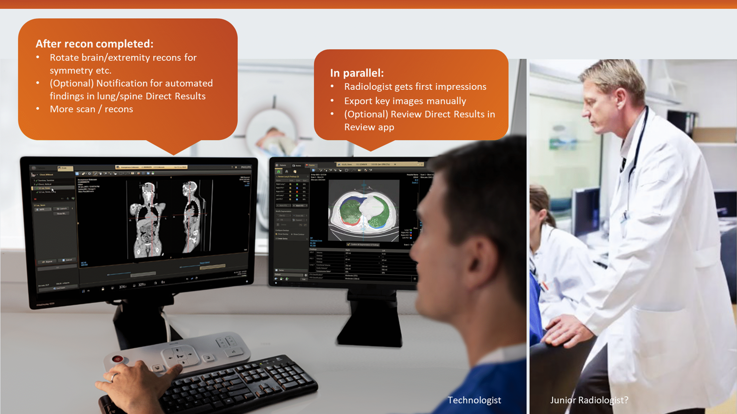
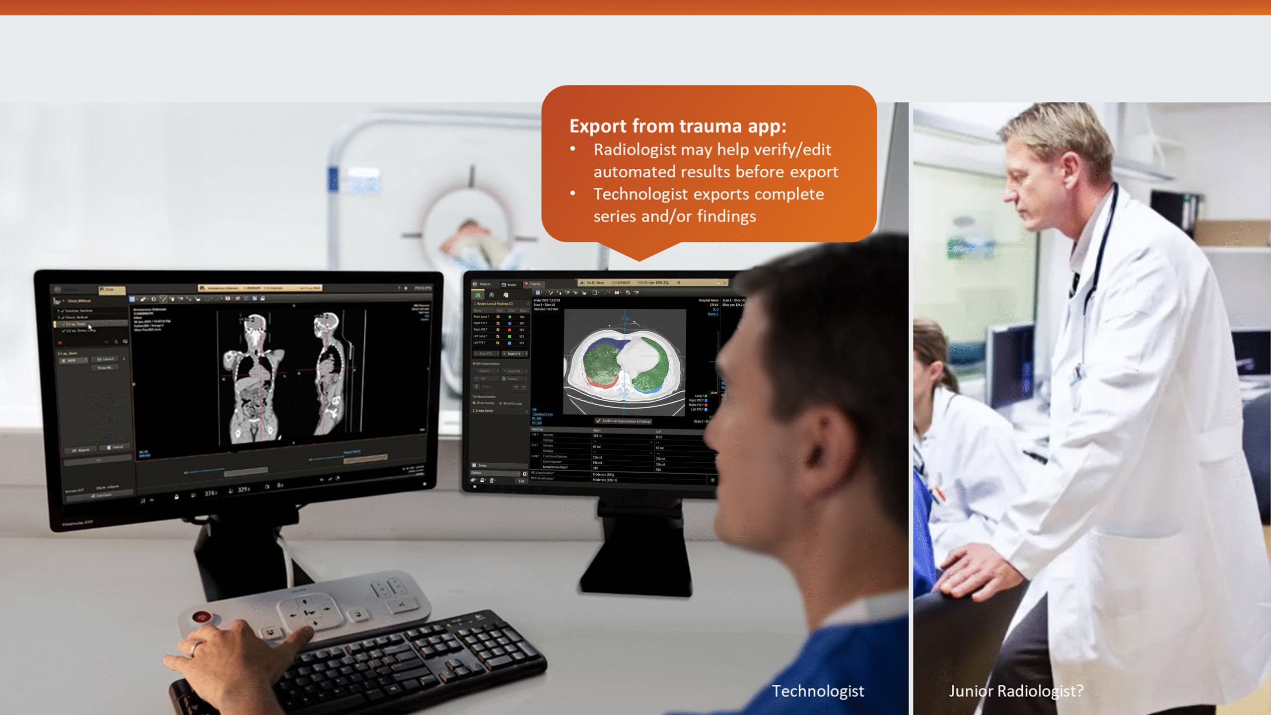
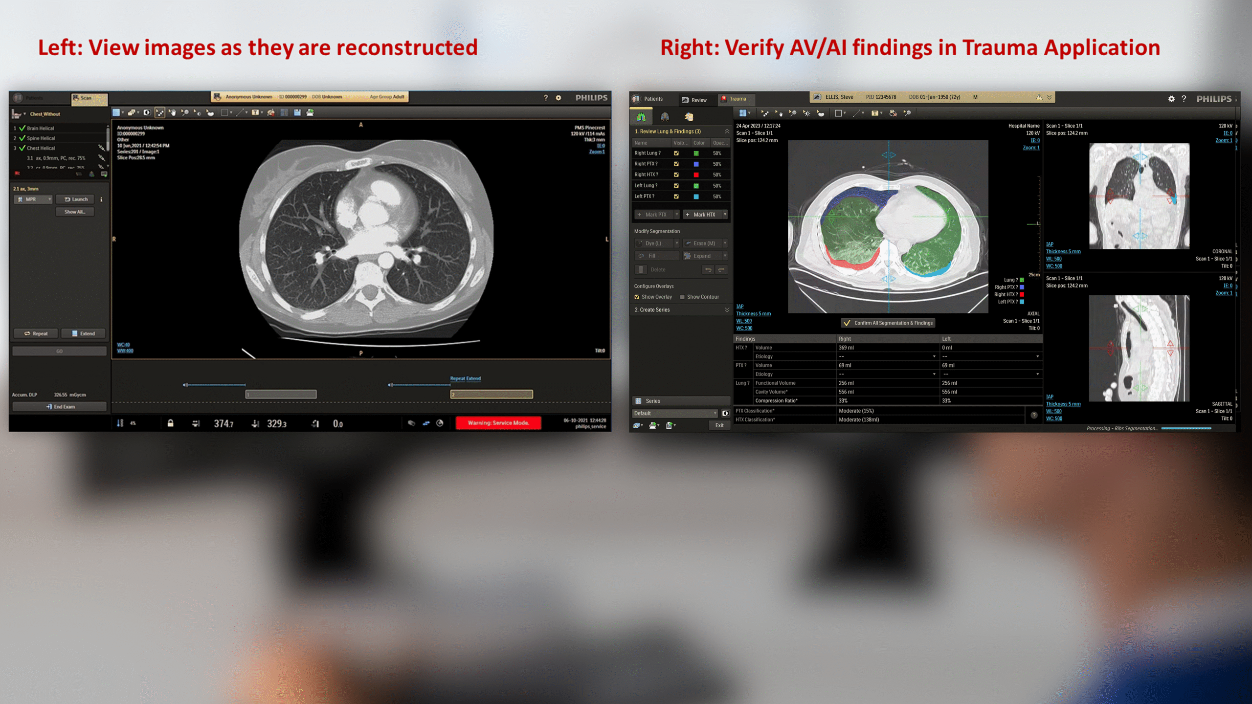
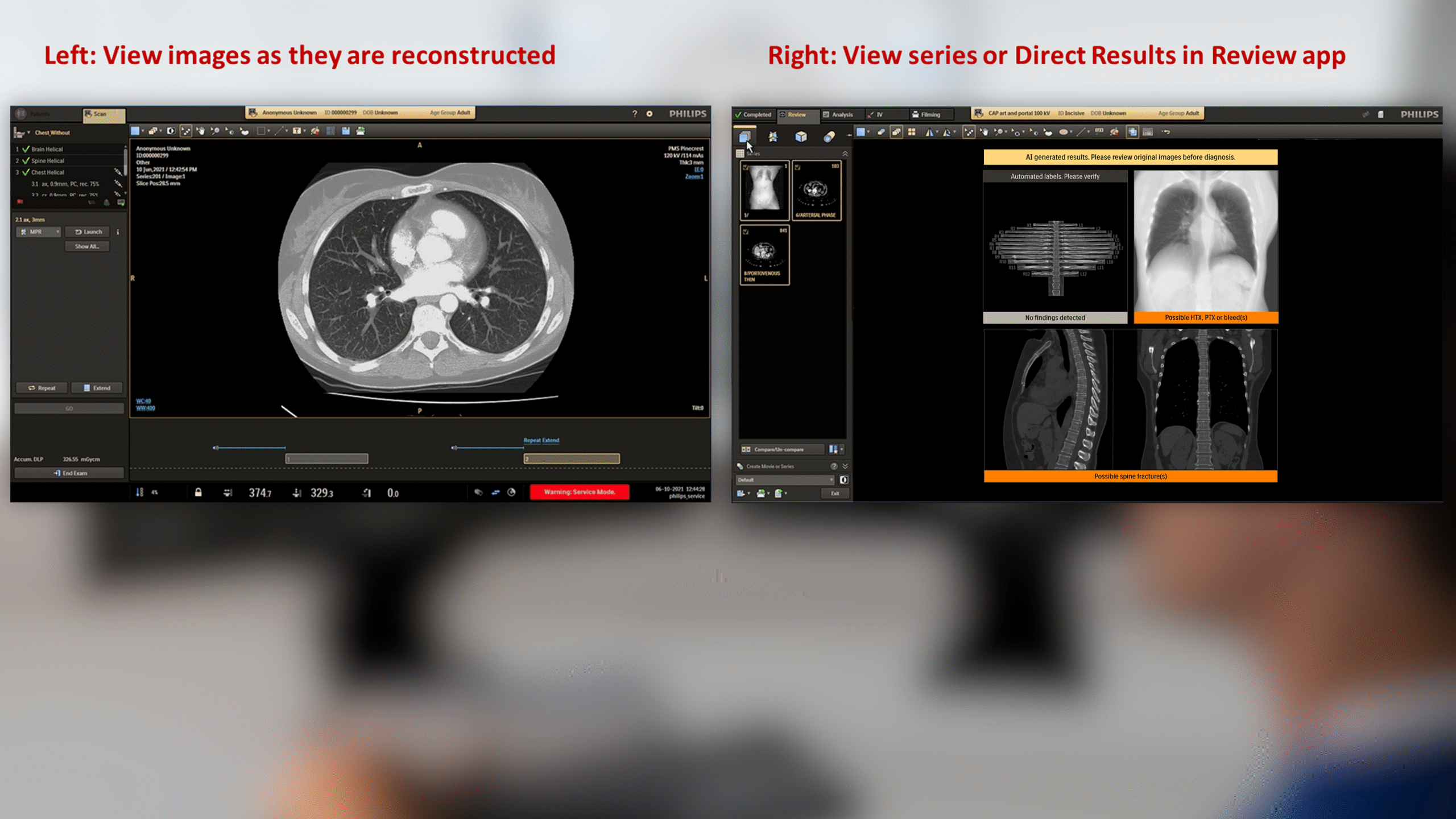
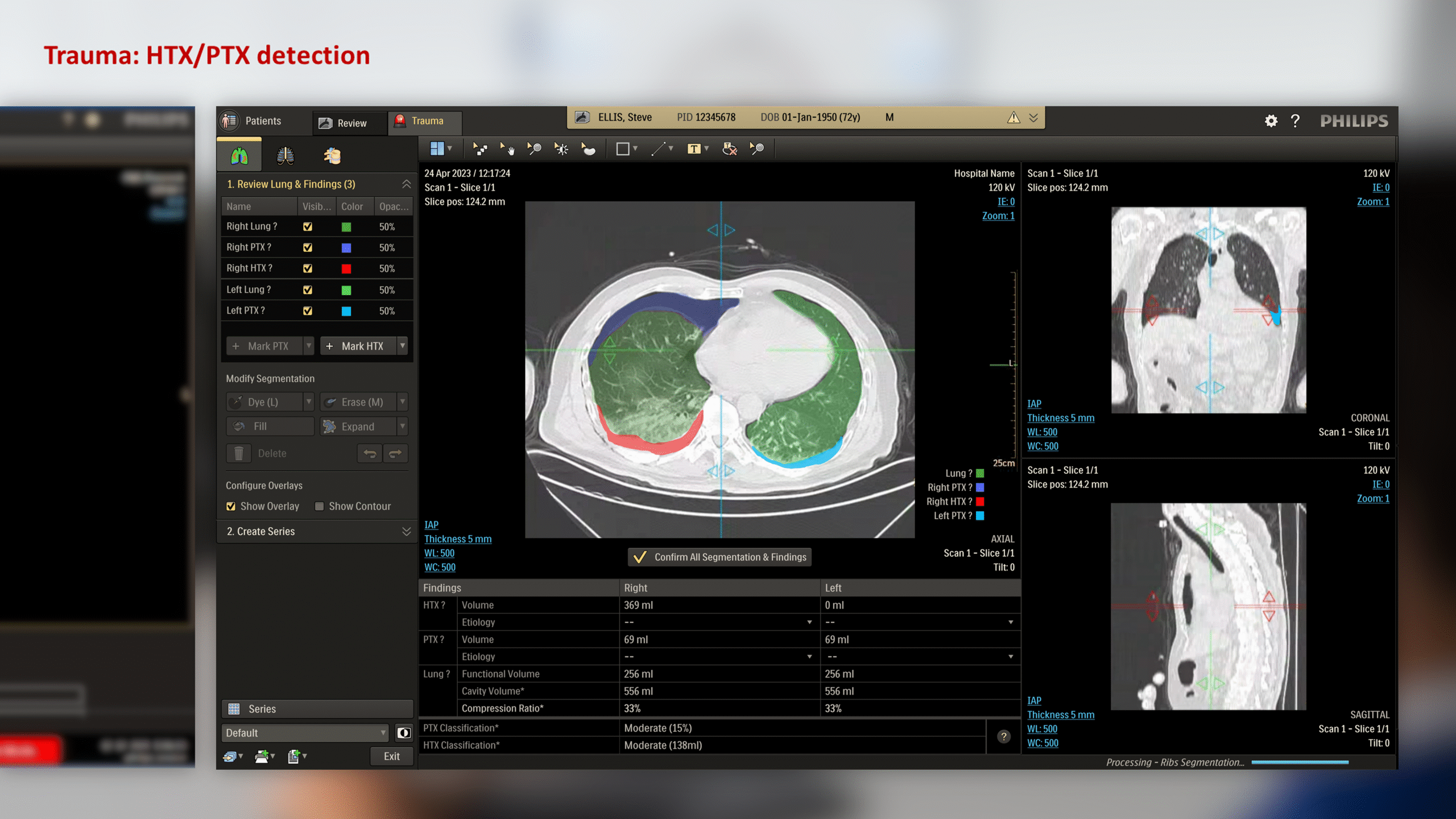
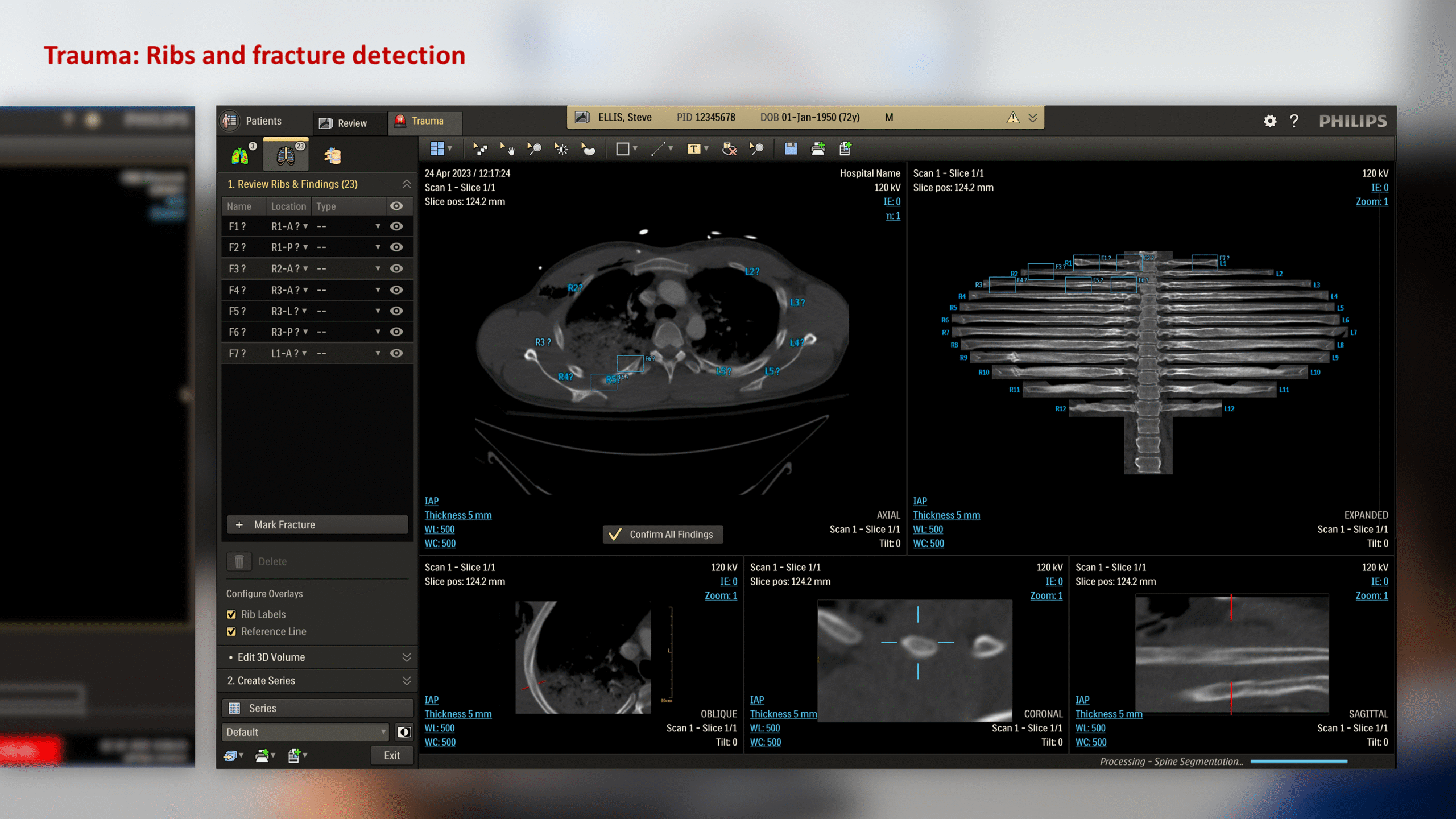
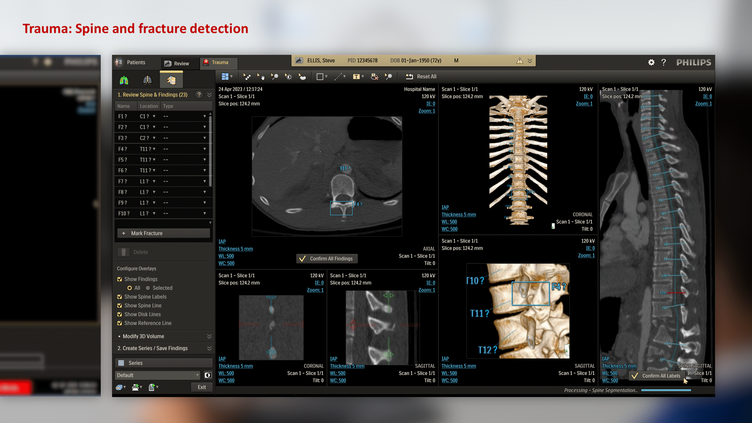
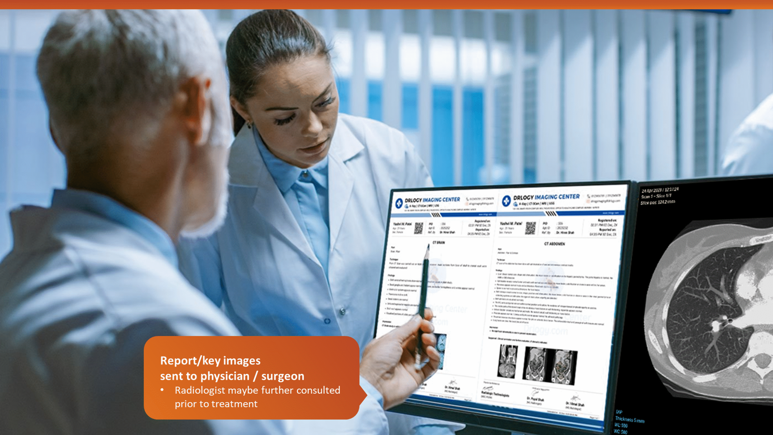
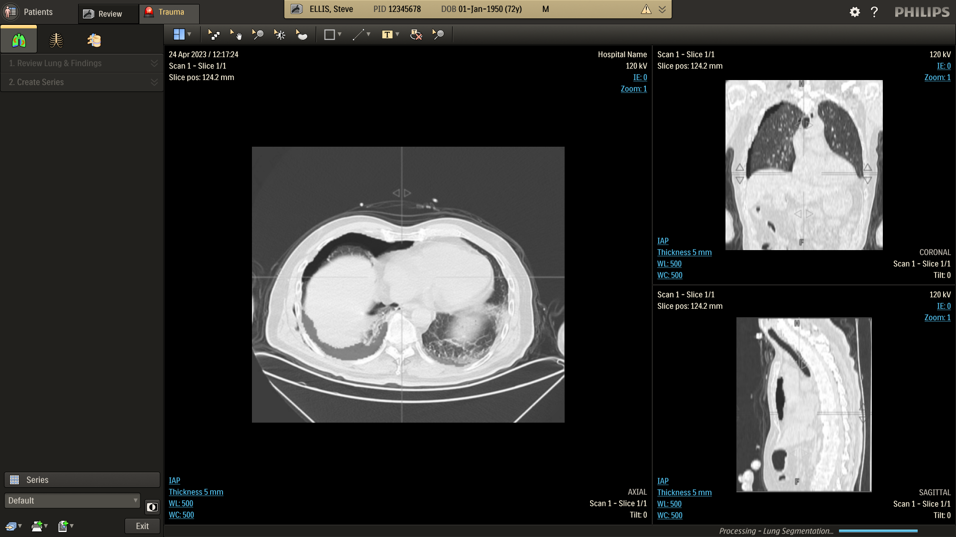
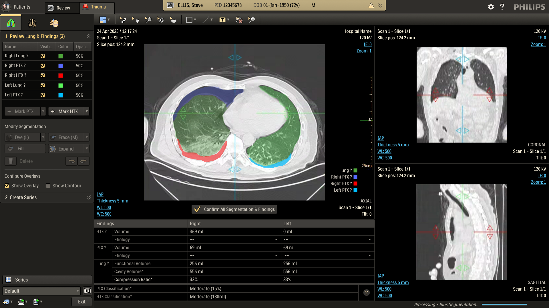
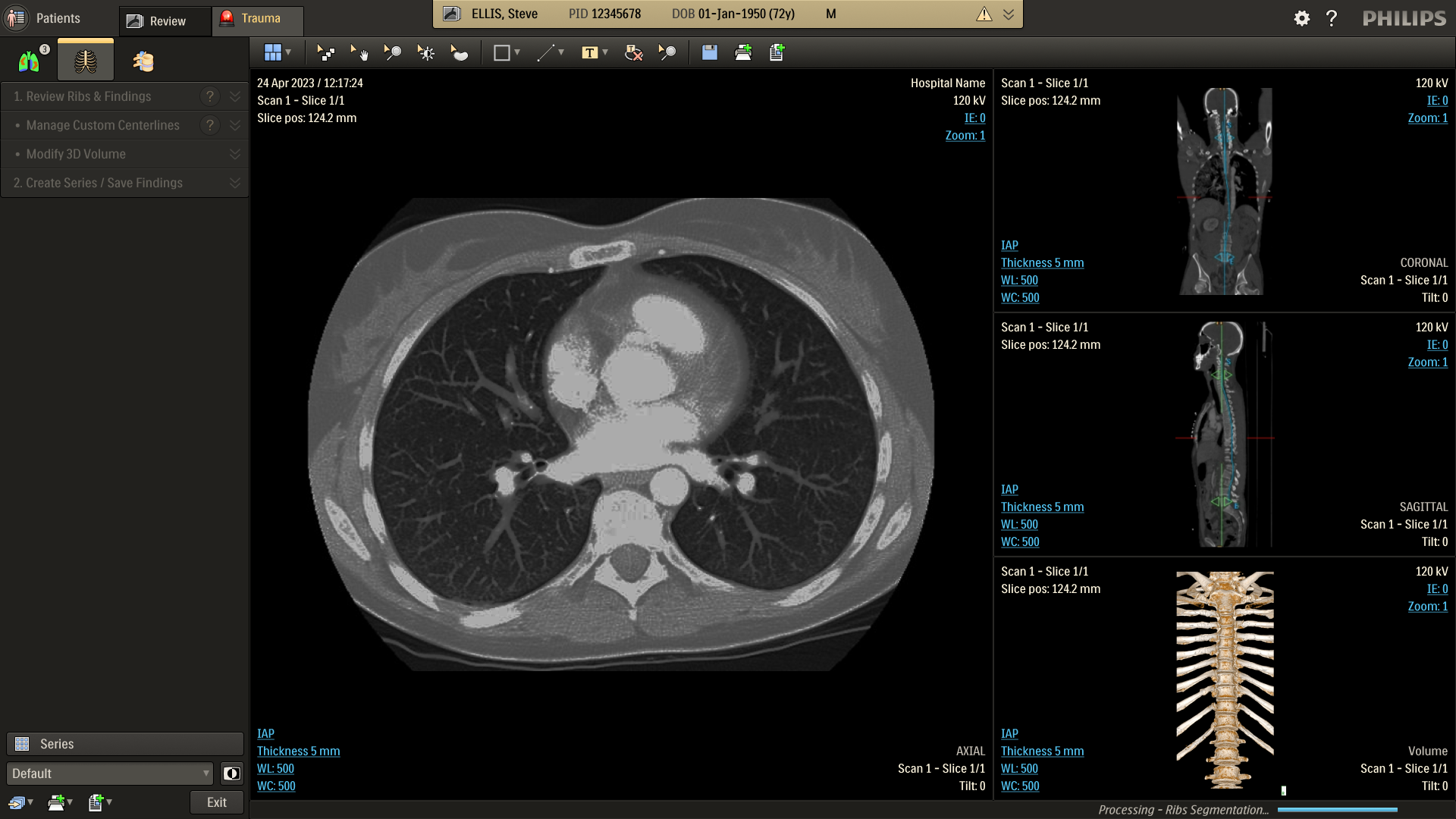
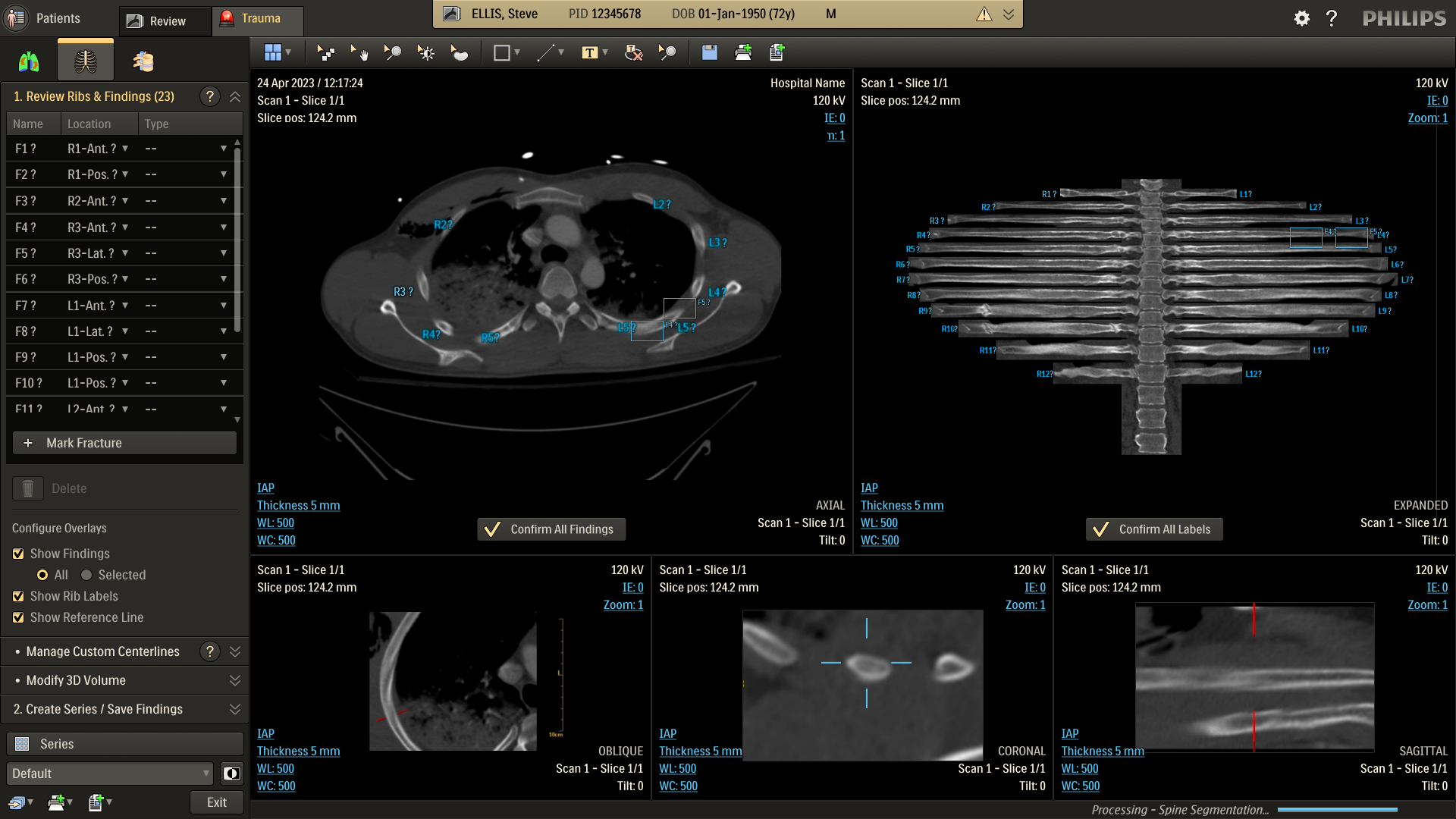
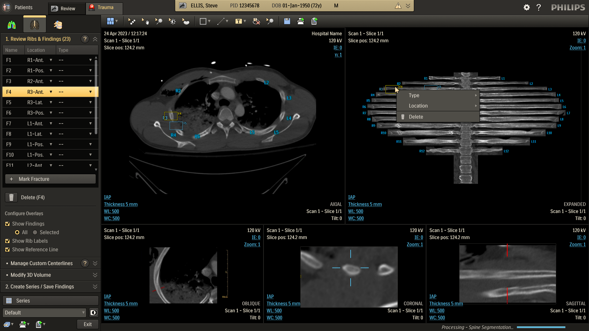
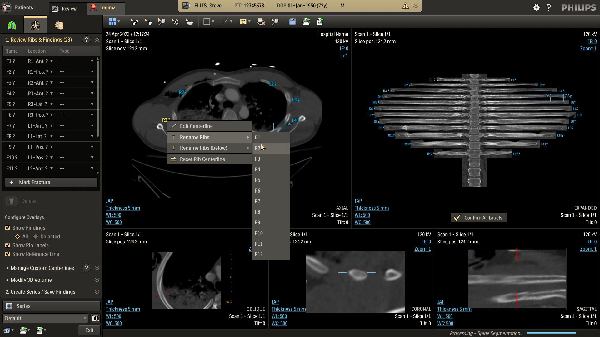
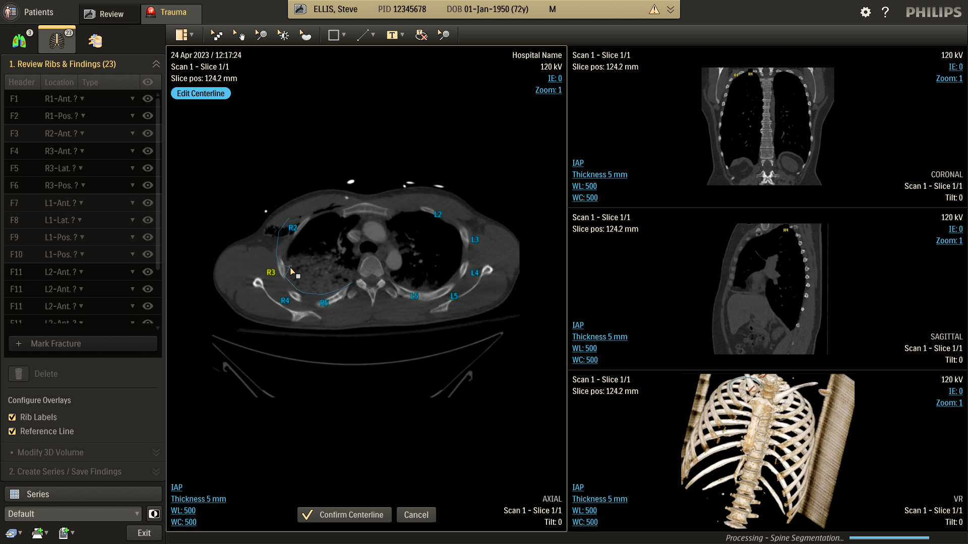
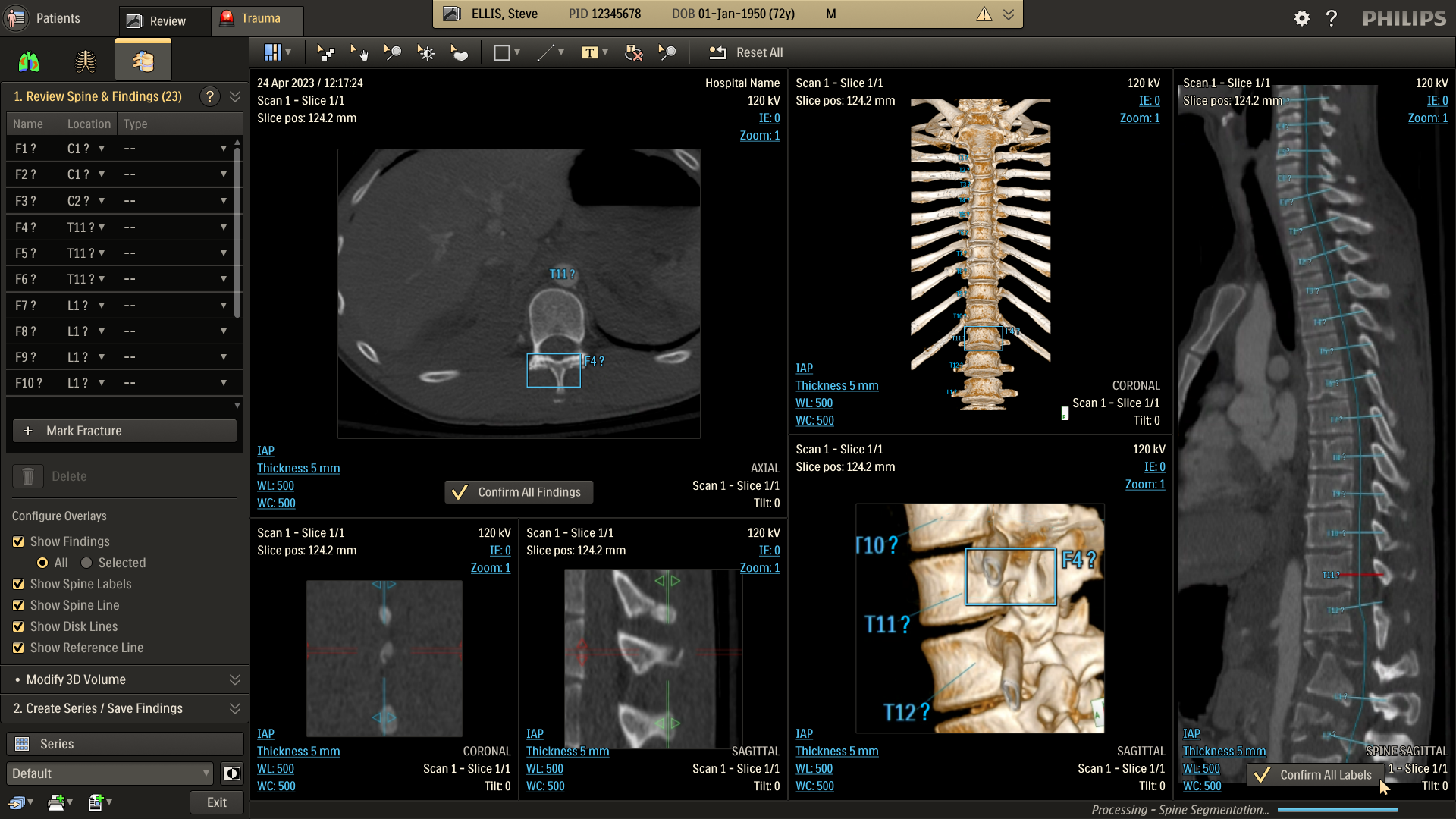
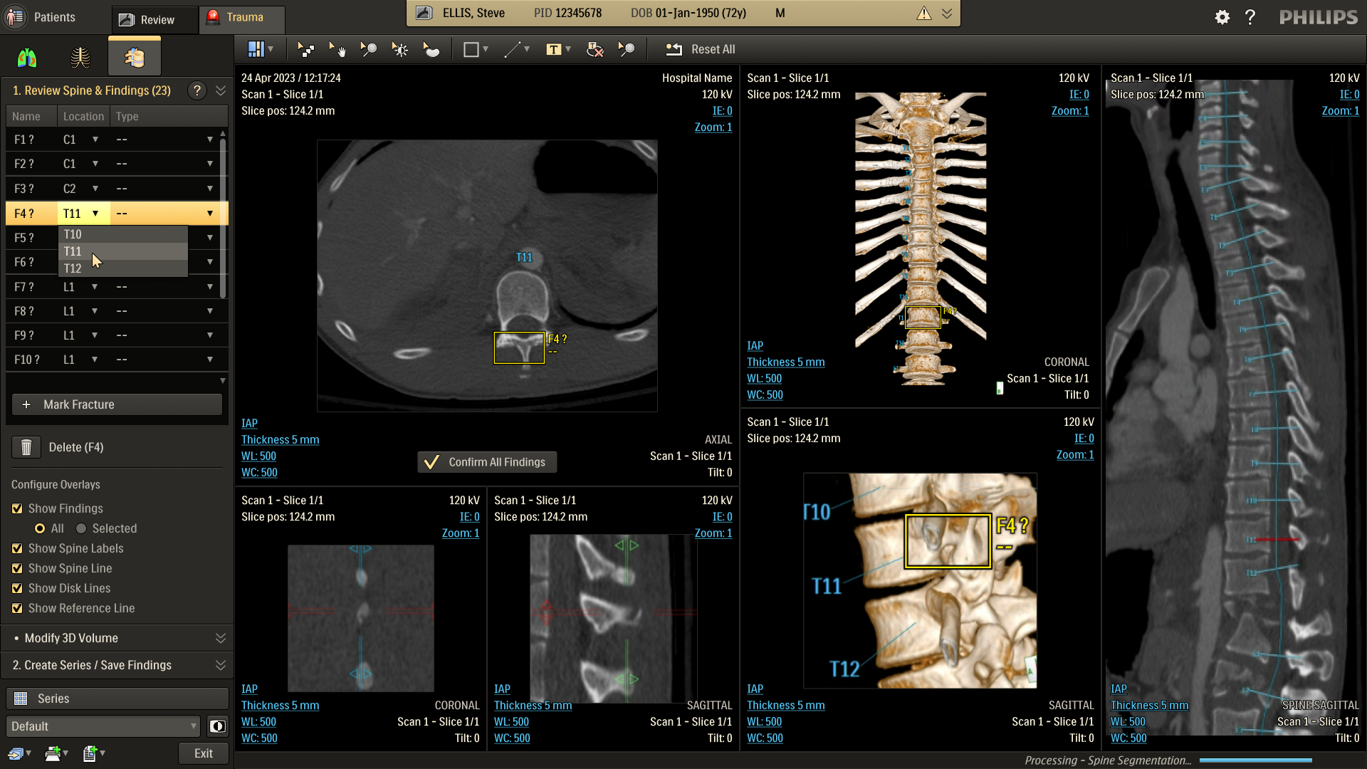
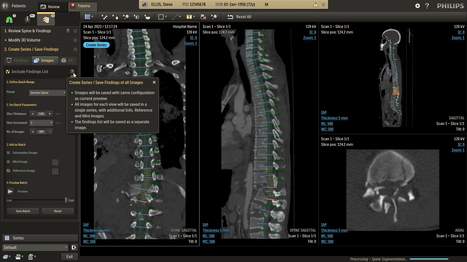
The CT Trauma app, built on this process, is meant to accelerate scan reading by auto-generating specialized visuals, labels, and findings, enabling emergency teams to quickly detect critical injuries and start life-saving treatment. The initial version was planned to offer three modules, covering Lung, Ribs, and Spine.
Having passed through the initial planning and prototyping phases a focus on R&D, the Trauma app had its core functionalities in place but needed critical design intervention to ensure acceptable user experience and clinical usability standards.
Business Needs
- Ensure clinical safety and usability
- Enforce Philips design standards
- Ensure optimized user experience
- Deliver a “first-time-right” product
Challenges
- Complex clinical software
- Strict regulatory & safety restrictions
- Multiple stakeholder teams
- Limited technical bandwidth
Analysis
Workflow
To better understand the problem, it was essential to first analyze the application’s usage context – its clinical significance, modes of use, and the intended users. A detailed workflow map of the application within its clinical setting was created, supported by user personas. This was informed by existing data and interviews with clinical team members.
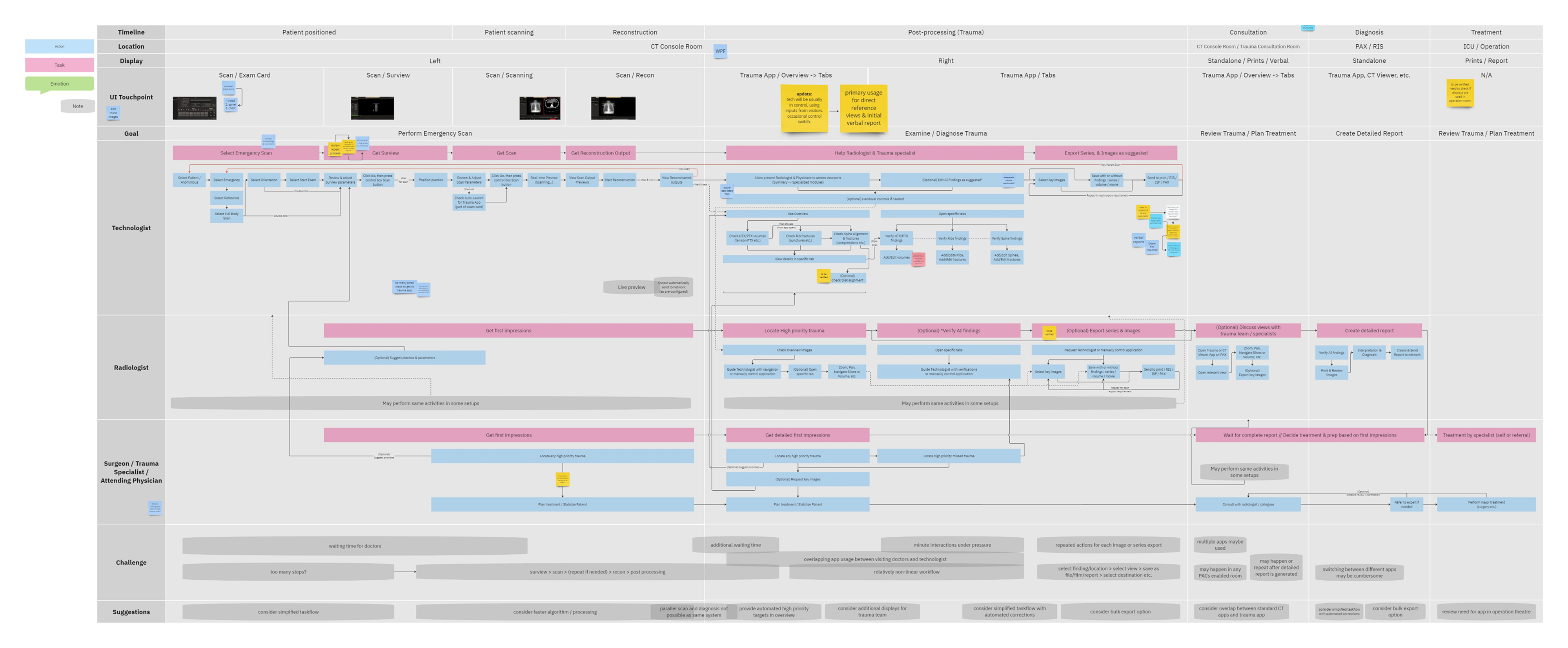
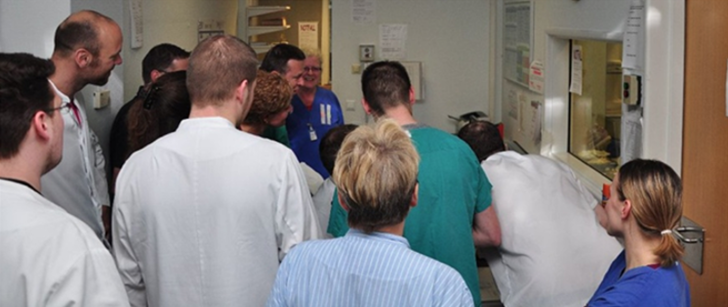
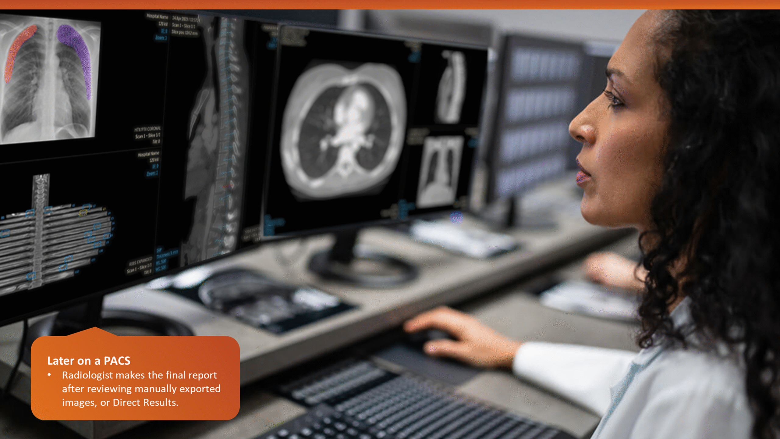
The workflow analysis confirmed a glaring issue: being limited to a CT console system, the application’s primary user was a Tech by default, even though only Radiologists can verify output data. During trauma cases, the CT console is often overcrowded, with multiple users competing for access in a high-pressure, time-sensitive environment. Patient queues at the console further limit opportunities for post-scan use of the application, which could otherwise help reduce user overlap.
A simplified workflow map and a presentation demo of the planned application features were shared with real users (with the help of colleagues in Europe) and a broader group of stakeholders. Feedback from these sessions confirmed that most users were unsure of features beyond the specialized image and findings generation, such as detailed editing and validation, within the CT room.
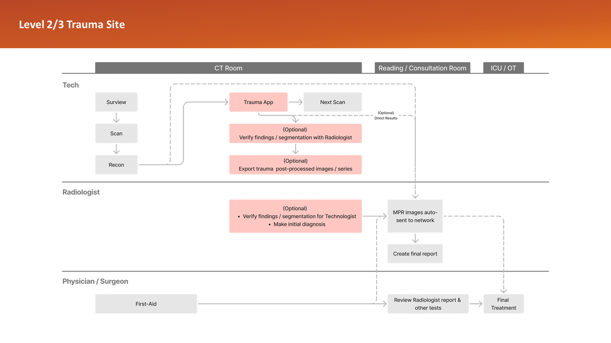
This insight helped stakeholders decide to narrow the initial clinical release to lower-level trauma centres. This would reduce user overlap and allow further refinement based on captured usage data before a wider rollout.
Heuristics
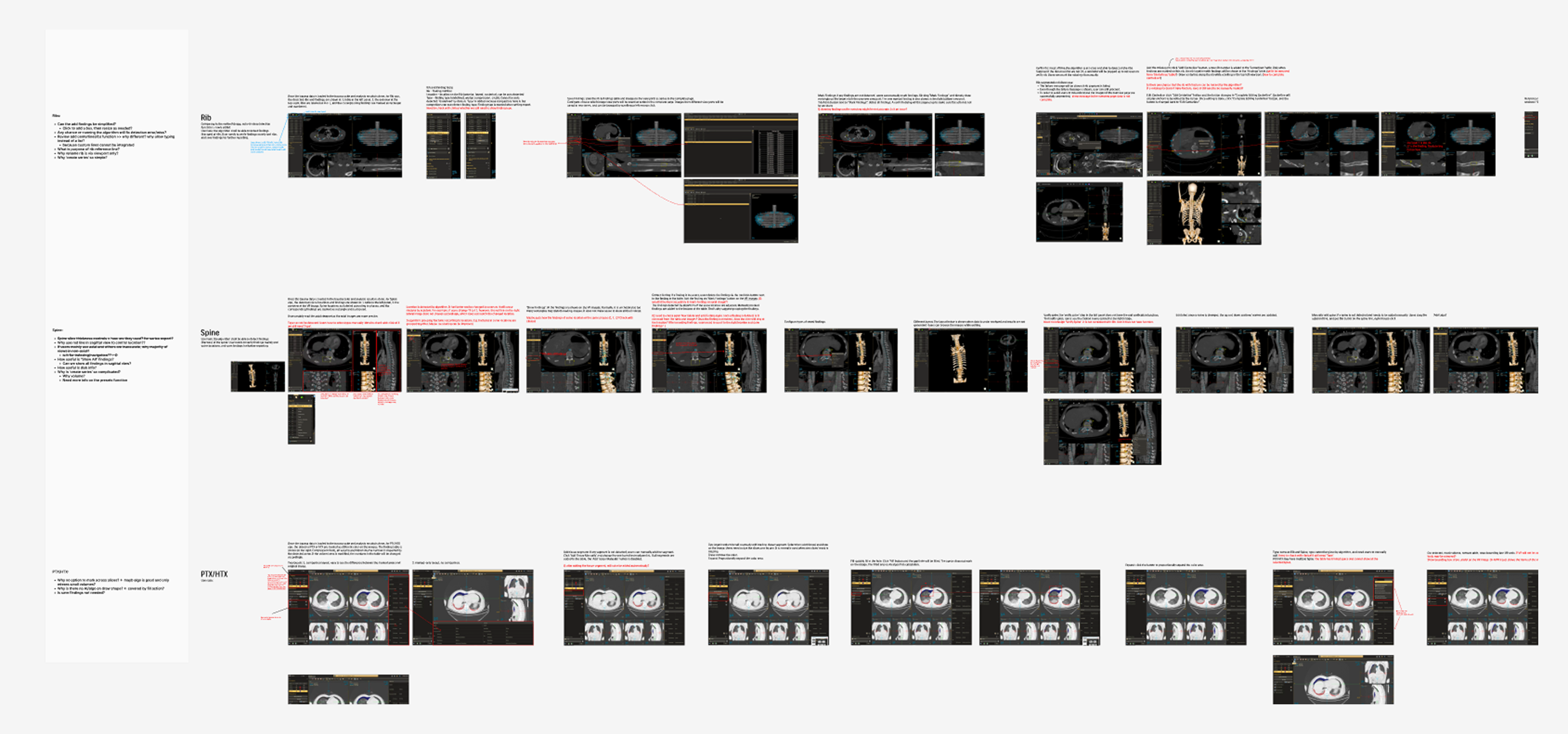
The R&D demo app was analysed for UX issues and taskflow discrepancies, as well as for inconsistencies with with the broader ecosystem of Philips CT applications and design standards. This exercise also helped map out key application functions in detail, creating a handy reference.
Summary
- The UI needed polish to fix numerous inconsistencies and oddities.
- Accessibility of image overlays and text needed improvement
- Key information and functions needed better contextual clarity
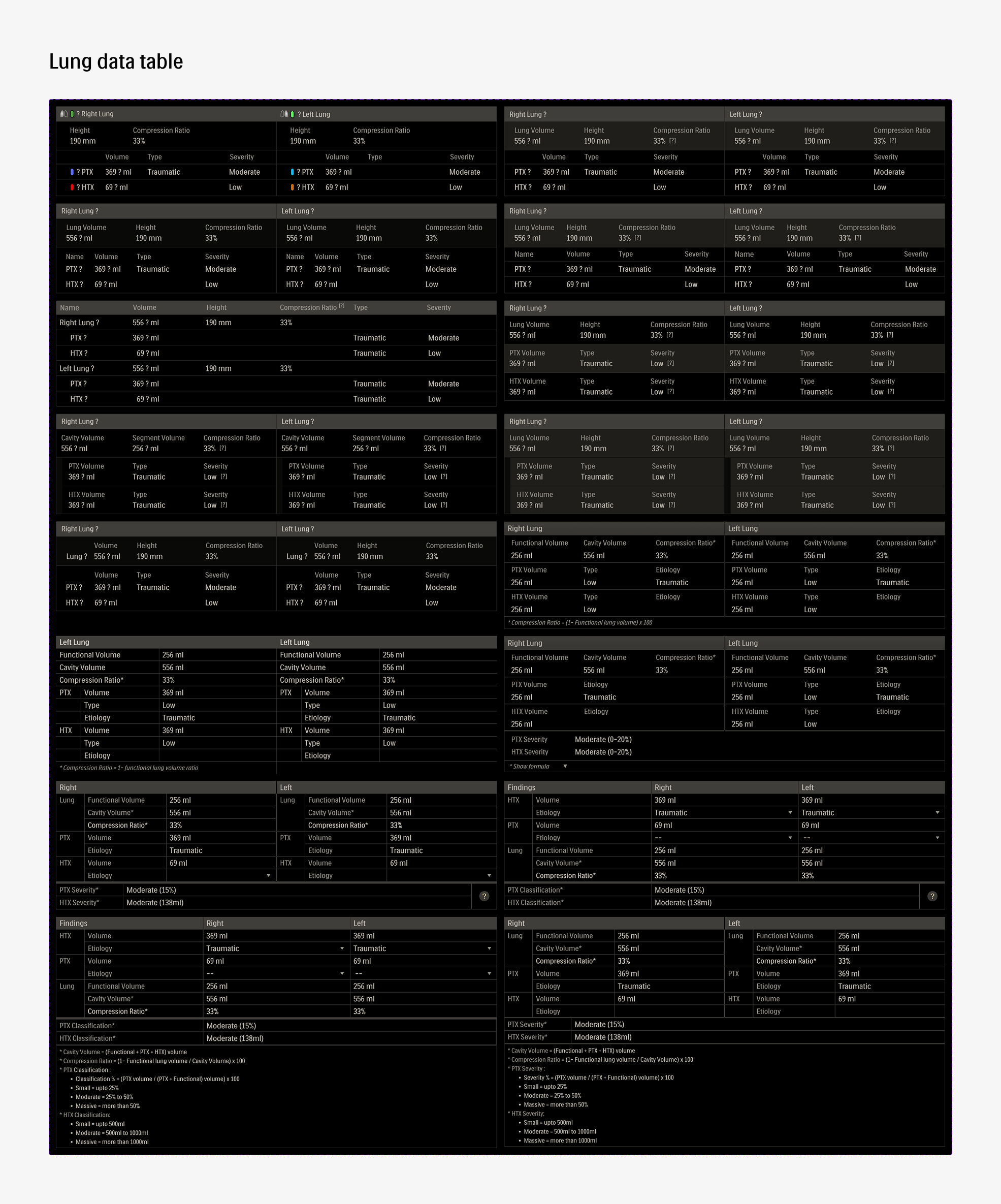
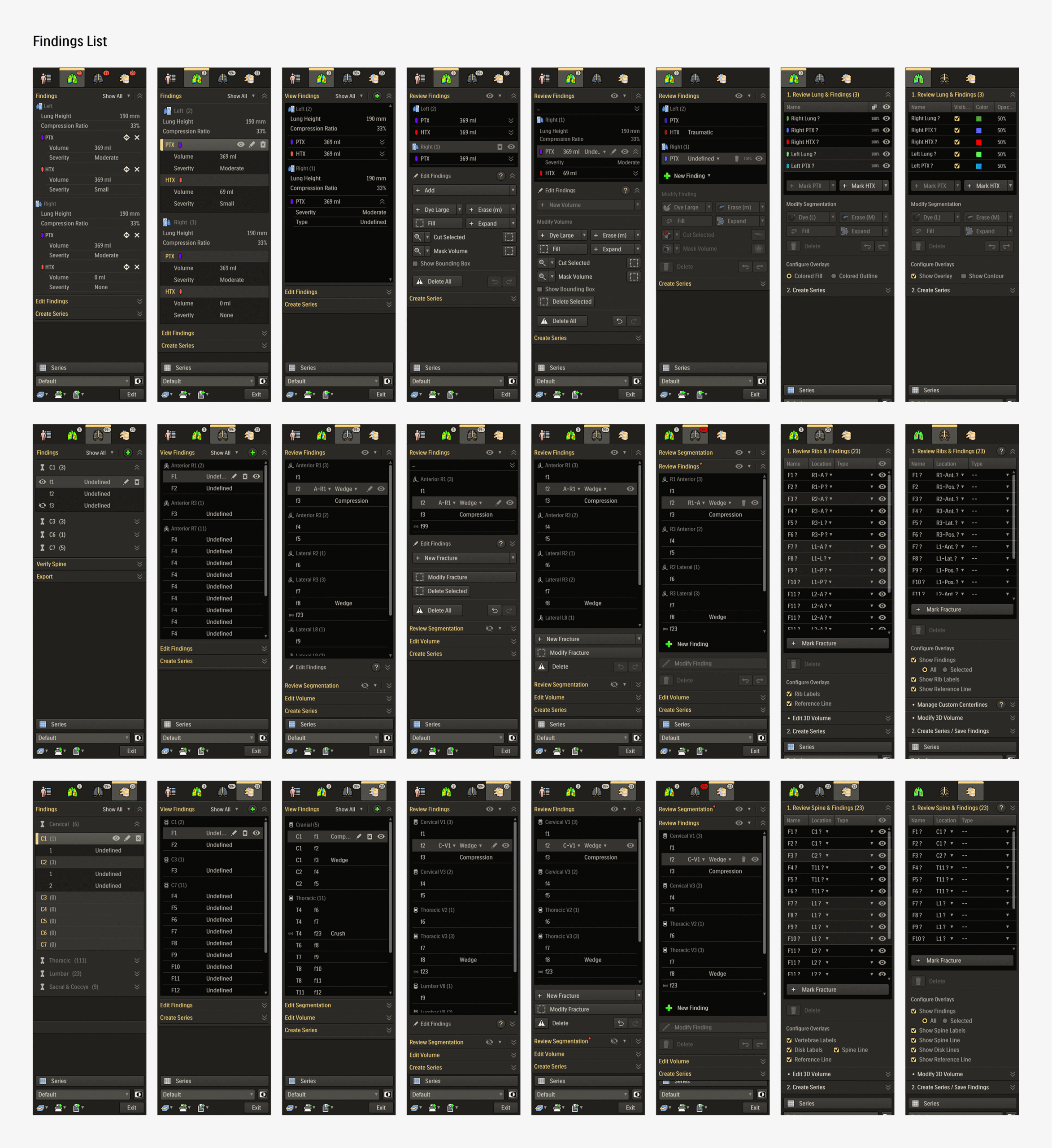
- List and tabular data needed layout improvement
- Buttons for functions needed to be grouped together
- Key functions needed to be available on viewport menu
- The overall experience needed cohesiveness:
- An overview or landing page was needed to unify results from all modules
- Visuals, text, and taskflow for same or similar functions needed to be streamlined
- Loading and empty states needed to be more meaningful
- AI driven results needed transparency
- Copy text needed clarity and uniformity
Planning
Usability
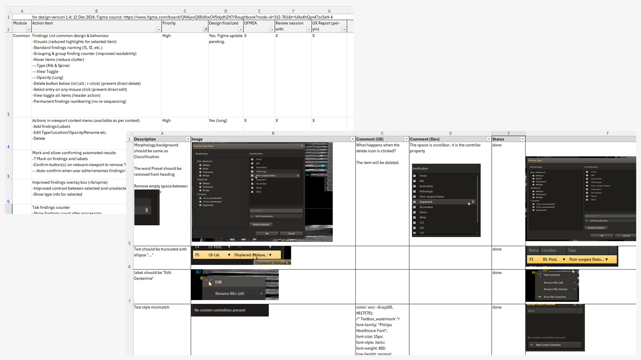
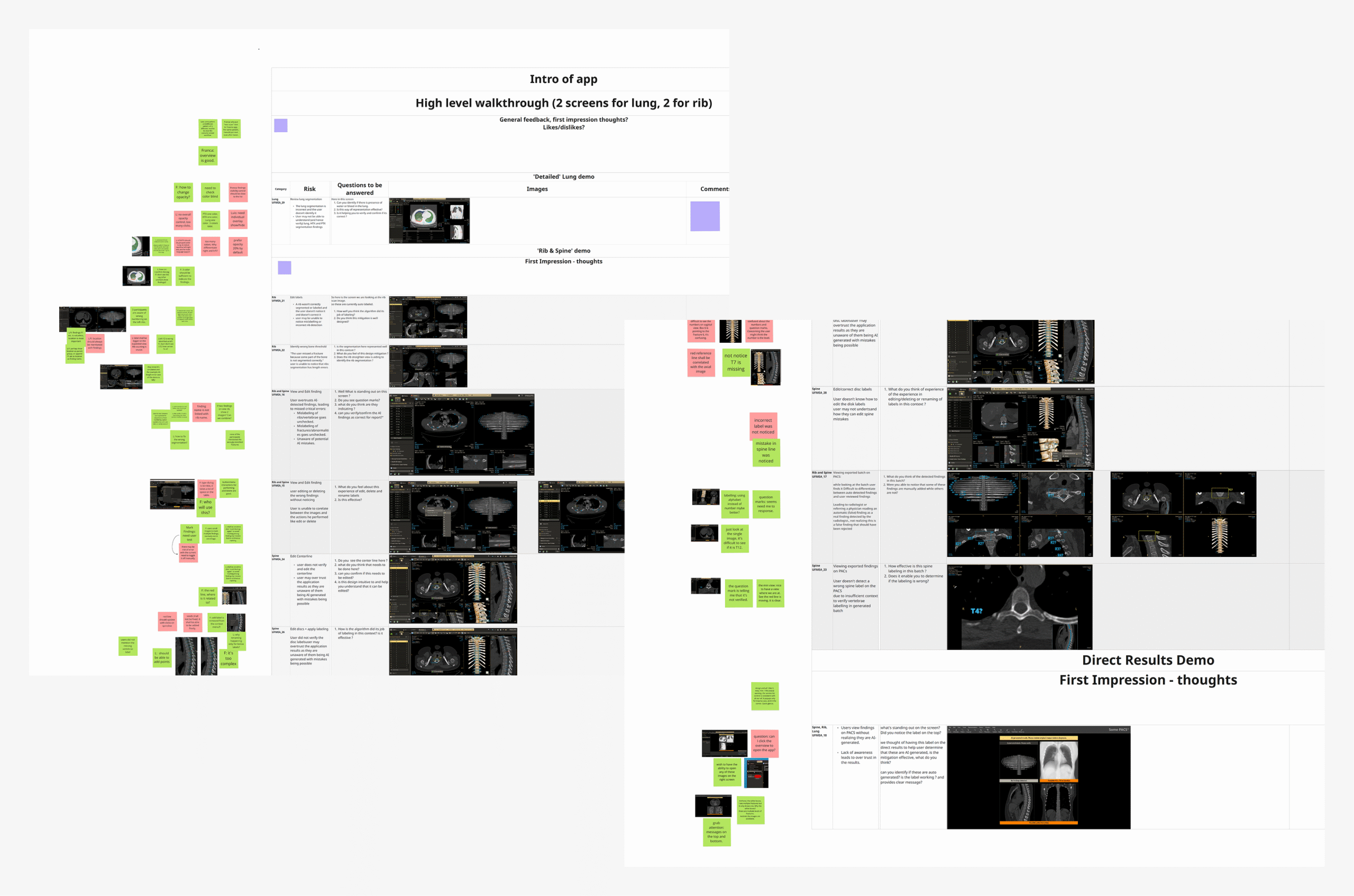
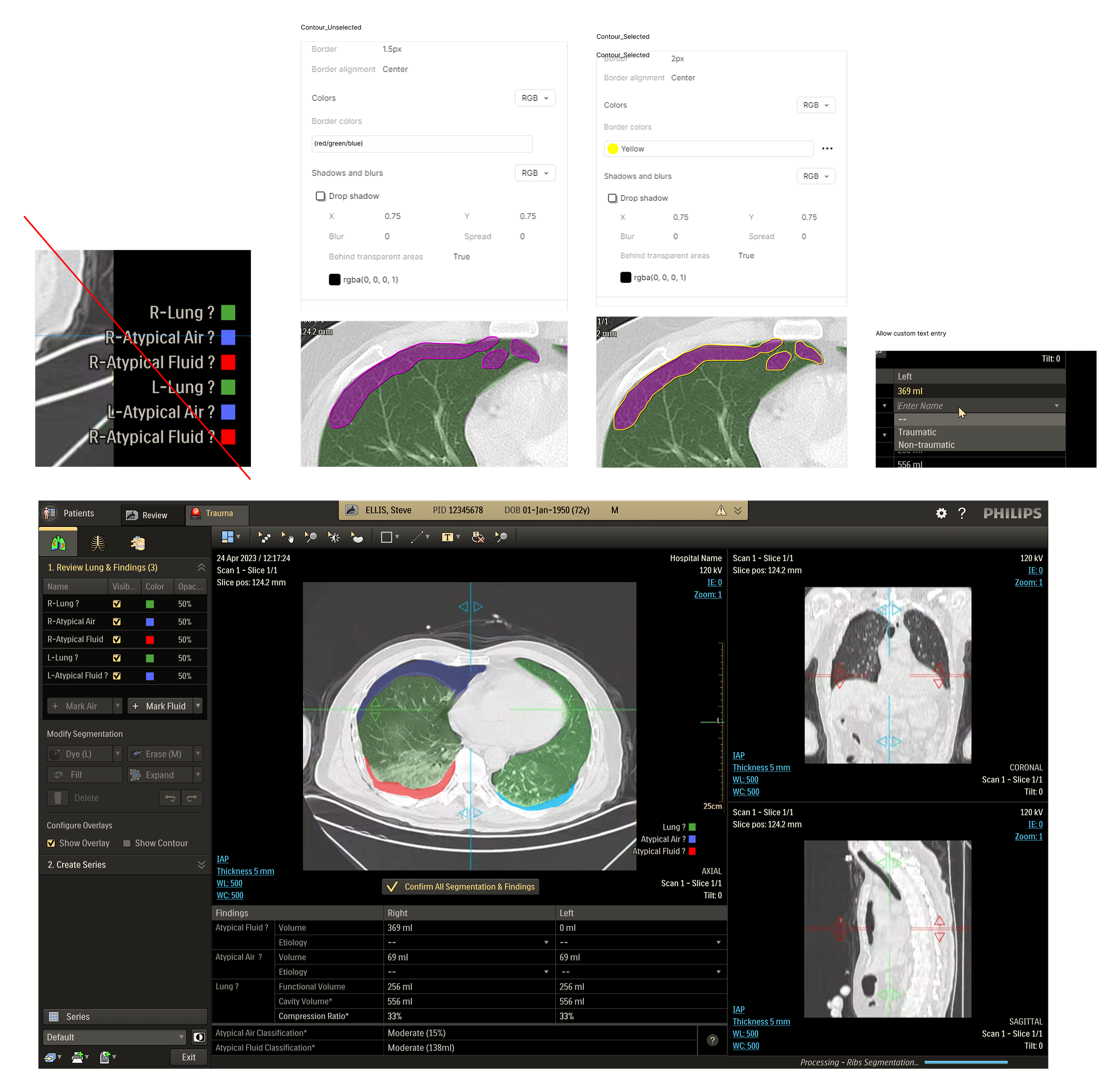
Mapping the key usage scenarios and related task flows was performed, with help from the R&D team, to further refine understanding of the application. This proved useful as a reference while generating the initial UFMEA (Use Failure Modes and Effects Analysis) document in collaboration with the usability team.
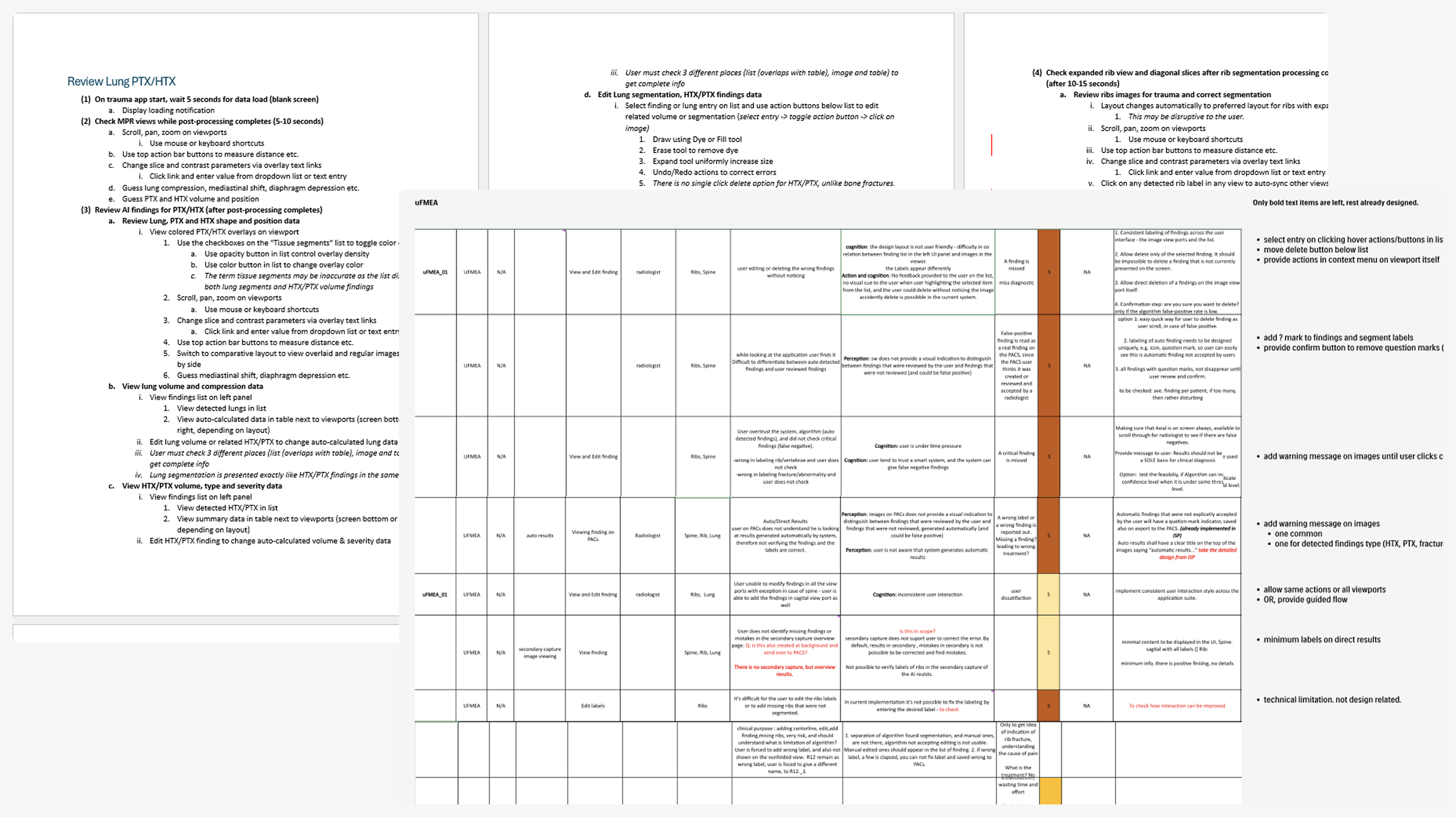
Major Items
- Separation of user verified and automated data is needed
- Risk of accidental data manipulation needs to be removed
- Relation between data editing action and image needs to improve
- Risks of mis-reading exported data needs to be mitigated
This helped identify potential safety risks by mapping critical tasks, failure modes, and their impact on safety and workflow efficiency. The UFMEA insights directly informed design priorities and shaped scenarios for future testing and validation.
Scoping & Prioritization
Discussions across the stakeholder teams, assisted by initial concept mock-ups, helped set the focus topics for design as well as their priority. These initial concept review sessions also helped evolve the scope for the the overview page into a more clinically valuable automated results delivery functionality.
- UFMEA listed items
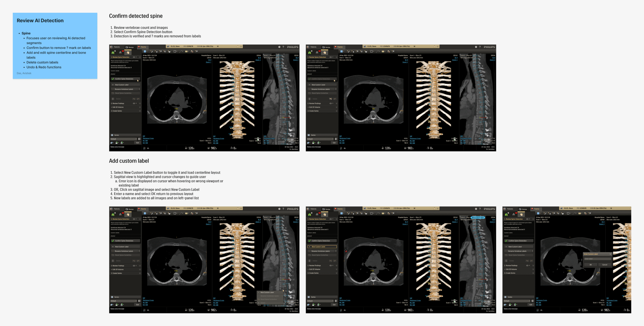
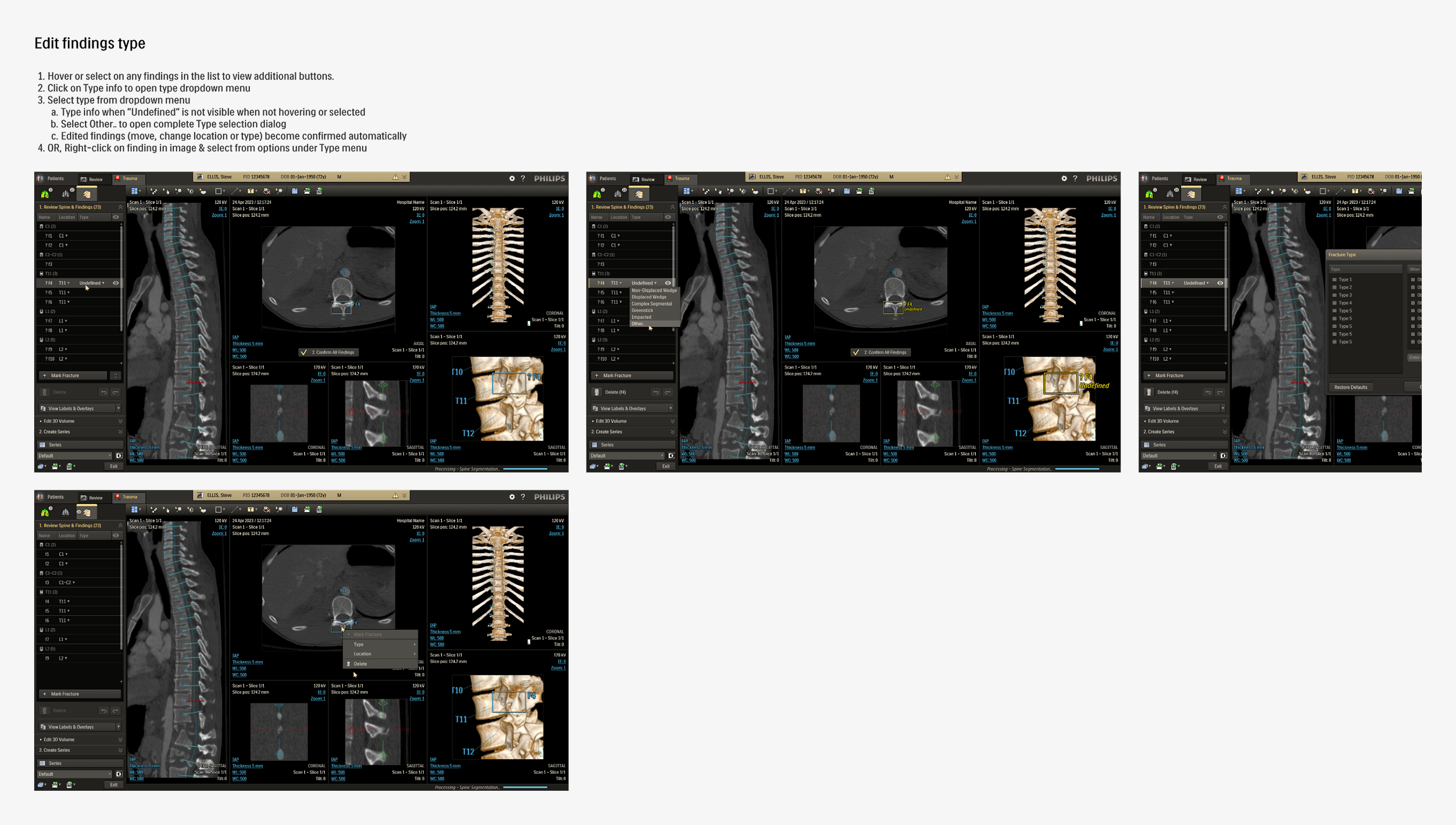
Overview pageDirect Results- Streamlining similar functions across modules:
- Findings list (priority)
- Add/Edit functions
- Export functions
- High impact UI improvements & bug fixes
DESIGN
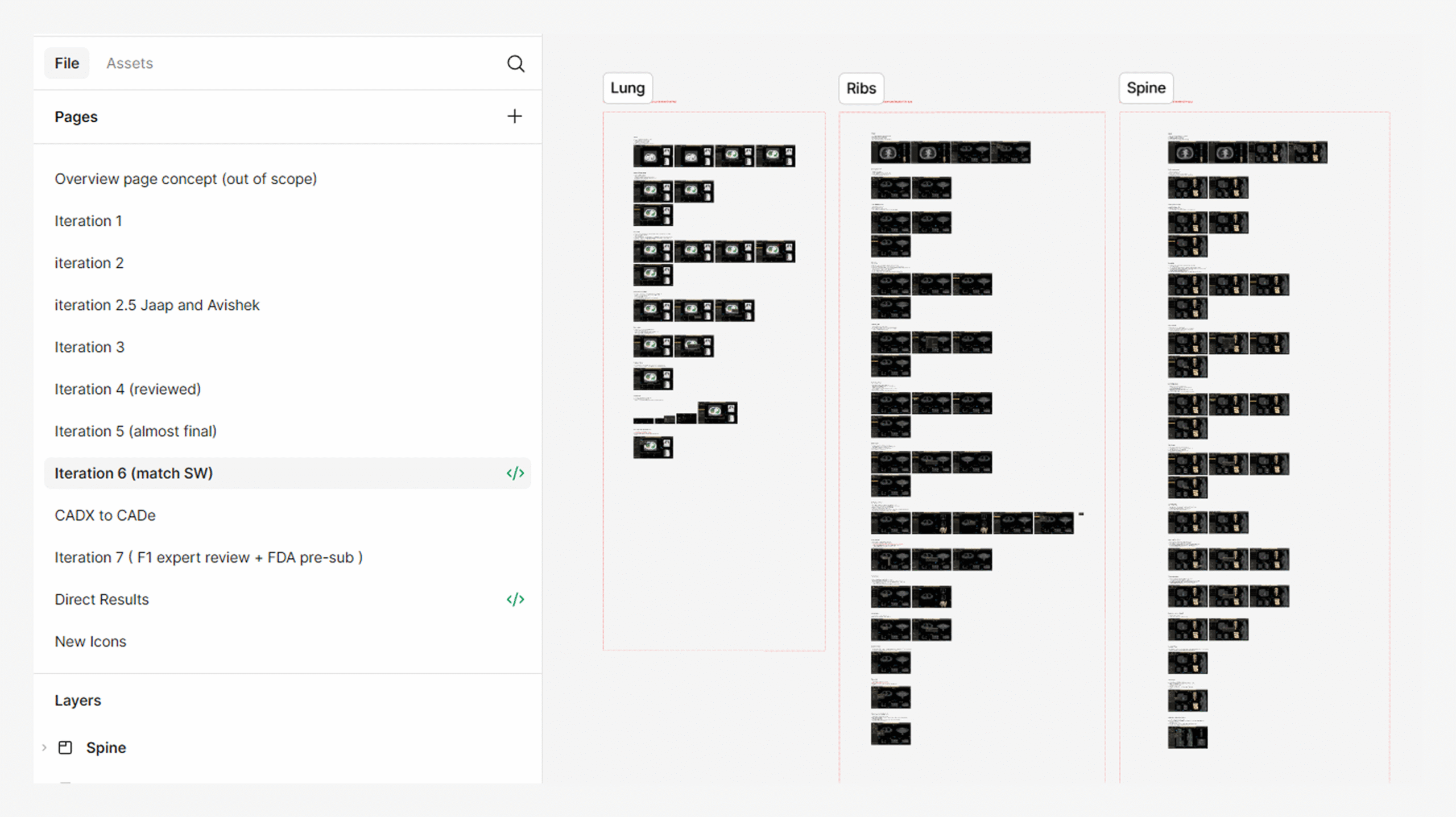
Iterations
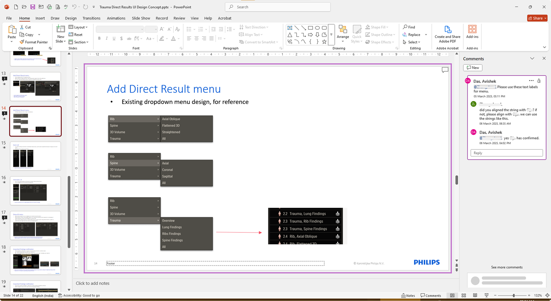
Detailed mockups of the design concepts, along with descriptions and taskflow maps, were created and reviewed in-depth with stakeholder teams. Based on the gathered feedback, the concepts were updated or replaced. This iteration cycle was repeated until consensus was reached on all key items, refining the application’s design and functionality using expert input from design, R&D, and clinical teams.
These detailed iterations not only refined the application but also improved feature clarity and decision alignment across teams. Once the final review rounds were over, the updated design required minimal handover for development before moving onto user testing.


Refine
Formative Testing
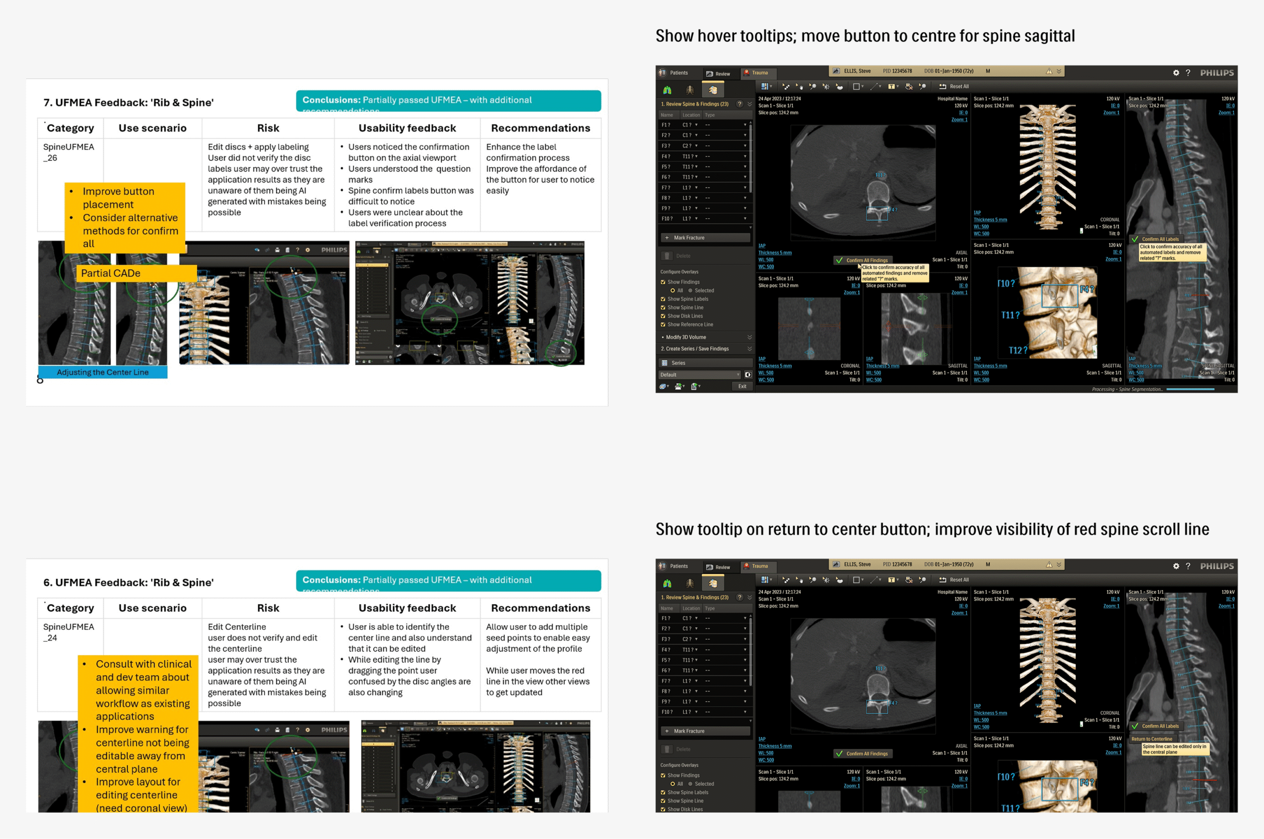
The refined application, having sufficiently high confidence across the teams, was presented for formative usability testing, with participants selected from internal industry experts. Sessions were focused on evaluating the effectiveness of designed mitigations for UFMEA items and gathering broader feedback on overall usability.
Revision
UFEMA mitigations with scope for improvement, as well as few high-impact usability topics discovered during the formative round, were used as the basis of another design iteration and review cycle. The resultant finalized version was ready for the upcoming rounds of formative and summative tests, with high confidence across stakeholder teams.
Retrospective:
The Trauma application was perhaps one of the most challenging yet satisfying projects I have worked on, where the end user experience can literally have life-altering consequences. Working on a clinical product demanded a careful balance between delivering efficient user experience and meeting the rigorous safety standards essential in healthcare. Coupled with a non-agile process, this left less flexibility for spontaneous design iterations, so every decision mattered.
The most difficult aspect was securing alignment across multiple stakeholder teams, each with different priorities and interpretations of requirements. Balancing safety-critical needs with usability best practices often meant lengthy discussions, careful compromises, and multiple rounds of review.
I learned that well-structured review sessions, backed by clear documentation and progress tracking, were critical to breaking deadlocks and aligning diverse stakeholders. Treating design reviews as collaborative problem-solving forums rather than approval checkpoints kept discussions purposeful and anchored in real user scenarios. This approach not only streamlined decision-making but also strengthened transparency and trust. These practices will remain central to how I lead complex, safety-critical projects in the future.